Helvetica - Three Periods of Type
No. 3 of 3 quick studies I did recently about historical typefaces.
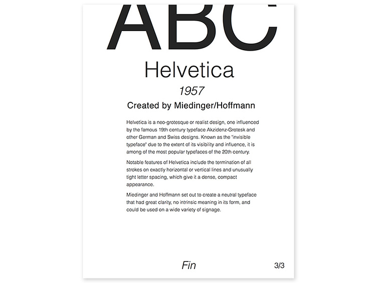
Helvetica is a neo-grotesque or realist design, one influenced by the famous 19th century typeface Akzidenz-Grotesk and other German and Swiss designs. Known as the "invisible typeface" due to the extent of its visibility and influence, it is among of the most popular typefaces of the 20th century. Notable features of Helvetica include the termination of all strokes on exactly horizontal or vertical lines and unusually tight letter spacing, which give it a dense, compact appearance. Miedinger and Hoffmann set out to create a neutral typeface that had great clarity, no intrinsic meaning in its form, and could be used on a wide variety of signage.

