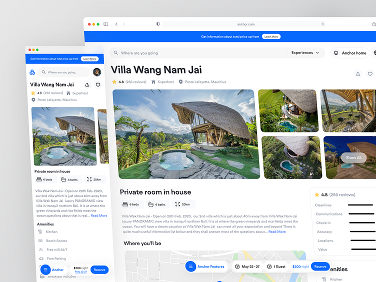
Anchor - Detail page Room🔥
Overview
The product details of AirBnB website application provide the accommodation details. This page provides basic information about the accommodation, such as the type of property (e.g. apartment, house, etc.), the number of bedrooms and bathrooms, and the location. They provide some details such as the availability calendar, photos, amenities, reviews, host information, and booking options.
The Challanges
On the current design they put too much informations in one page and will causing usability issues. In the rental price details section, they are still not precise, very unclear and takes too much spaces which actually must be presented clearly and easily understood, have to sse simple and concise language, and avoid clutter and confusion.
The Solutions
We consider to update the look and feel of the website & improve the user experience. Simplifying the design and help to reduce the amount of space it takes up. Consider removing any unnecessary elements, simplifying the layout, and using a more minimalistic approach. So, we tried to put less informations than before but still focusing on highlight the most important and compelling features of the app, and use clear and concise language to explain them.We made the design more compact, summarizing the testimonials and amanities sections. Also we made those sections are sticky. We offer a button navbar for order details, to enter how many days we spent on the form. Organize the text and use collapsible content such as accordion menus or tabs, can help to reduce the amount of space your content takes up.
Interest to partnering with us? Say hello at hellodama@odama.io or visit our website odama.io
Check us more at:
📷 Instagram | 🛒 Gumroad | 🎉 Figma Community | 🛍 Creative Market


