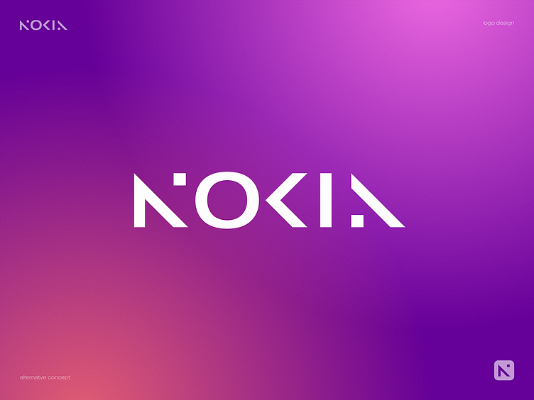
Nokia Logo Redesign - Alternative Version
I couldn't just pass by the current "Redesigned Nokia Logo Redesign Trend" :)
So here's my take on this. The idea is to add more rhythm to the logo layout by using similar geometry of "N" and "A" letters and adding a "pixel" element for a more dynamic and techy feel.
Let me know what you think!
Contact us to get your logo design or branding project done:
More by Dmitry Lepisov View profile
Like

