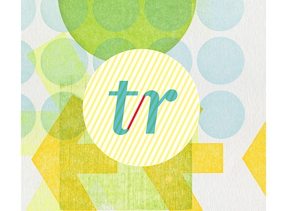
Talent Resources logo
for Talent Resources, I played with “t” and “r”. The primary focus upon the letters coupled with the color palette provides an individual voice that is very inviting, fresh, and unique. The accented pink line that connects the letter “t” and “r” symbolizes how Talent Resources is the “connector/bridge” within the industry.
More by Jihee Kim View profile
Like
