Fintech Website Concept: Using Bright Accents and Dark Outlines
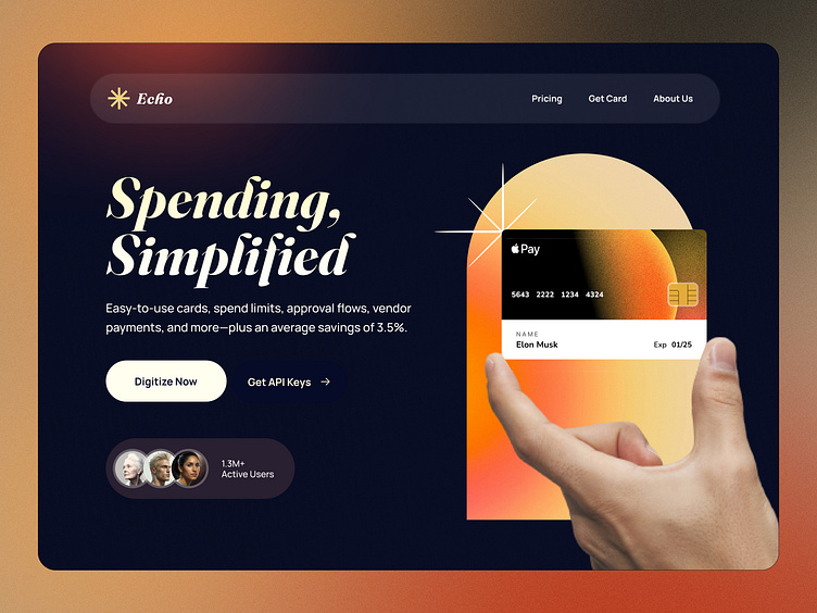
Check out our latest fintech website concept featuring a newly published illustration piece. Our use of bright accents and dark outlines create maximum contrast and precision for an eye-catching design.
Our fintech website concept showcases a newly published illustration piece that incorporates bright accents and dark outlines. By using this design technique, we were able to create maximum contrast and precision for a visually striking user interface.
The use of bright accents draws the user's attention to important elements while the dark outlines help to define and emphasize these elements. This design approach not only creates an attractive user experience but also helps to improve usability by making key information stand out. If you're looking for a fintech website concept that is both visually appealing and functional, be sure to check out our latest work.


