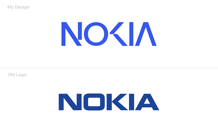
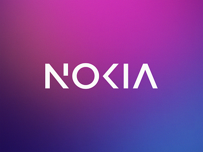
Nokia Redesign Concept Idea
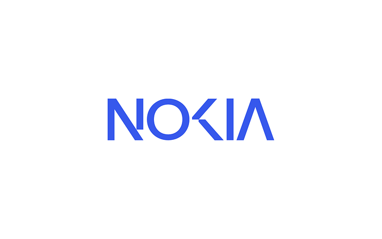
The new logo of Nokia has a problem from my perspective. The readability of Nokia's new logo allows people to misread the logo as "AOKIA" or even "AOCIA". My logo redesign attempts to solve the readability problem and conveys a more sophisticated feeling.