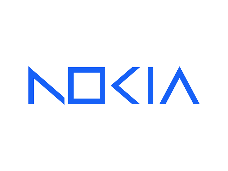
Nokia logo redesign idea
The square "O" can be more closely connected with "N" and "K" to make up for the excessive missing parts. The new shape of "A" is more in line with the design of the other four letters, and can be written in a streamlined way with one stroke.
More by Accelerator View profile
Like

