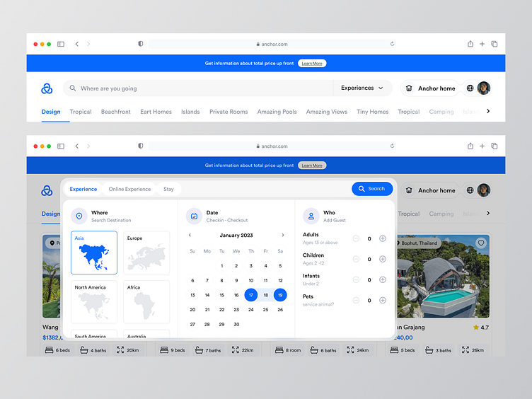
Anchor - Navigation Booking & Filter🔥
Overview
When users are able to find the accommodations they want quickly and easily, it can lead to a more positive user experience. Clear filters make it easier for users to navigate the app, find what they need, and complete their booking in a hassle-free way. If the filters are not clear, users may have difficulty finding the specific type of accommodation they are looking for, such as a particular price range or another features.
The Challanges
The difficulty in finding suitable accommodation options, where users may find it challenging to search and filter through the vast number of listings available on Airbnb to find suitable accommodation options that fit their preferences and budget. With the booking process being complicated or unclear during the booking confirmation.
The Solutions
Simplify the language by use clear and simple language in the filter options to make it easier for users to understand what each option means. Avoid using technical terms or jargon that might confuse users. In here, I was offered a combined filters so users don't have to expand each feature to fill the form. Also, incorporate icons, graphics, and other visual cues to help users quickly identify and understand each filter option.
Interest to partnering with us? Say hello at hellodama@odama.io or visit our website odama.io
Check us more at:
📷 Instagram | 🛒 Gumroad | 🎉 Figma Community | 🛍 Creative Market


