Moon | iOS | NFT Marketplace App Concept
01_Project _Overview
The_Agenda
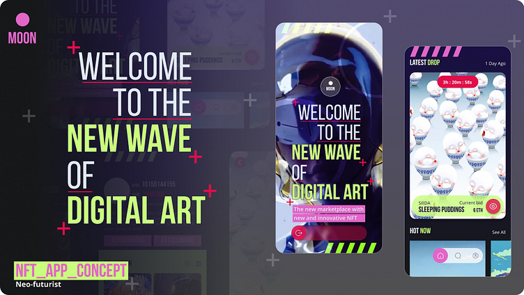
For the Intro to UI Design Course by Dribble we were assigned the task of creating a prototype app for promising new startup called ‘Moon’, that sought to transform the NFT marketplace by offering a ‘design-first approach’ and providing a ‘deeply curated experience for users’.
The objective of the course was fairly straight-forward; establish the visual language/identity of this new NFT app, produce hi-fidelity wireframe mockups of key screens and subsequently deliver a design library of UI components, along with a functioning prototype.
Given that the target audience consists of ‘tech-savvy’, would-be art collectors, with an understanding of NFTs, blockchains and cryptocurrencies, the project required a strong visual aesthetic that would appeal to a group of people who ‘value curated and beautiful experiences as much as they do with... digital art.
02_Moodboards
The_Approach
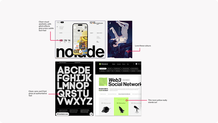
Trying to choose a starting point can be intimidating, however, considering the user base, and their penchant for all things digital, I decided to explore images around science-fiction and futurism (the aesthetic, not the movement ;))
As an 80’s kid, and gamer, it was easy for me to gravitate towards a retro-futurist aesthetic for my first set of images, while for my second set I opted to move towards a far more tech-mech-sci-fi look-and-feel.
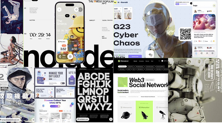
Once I was happy with both my collections, I trimmed them down to the most visually interesting, or eye catching, to provide me with the inspiration for my subsequent design choices.
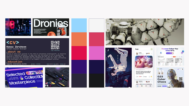
03_Visual_Exploration
The_Aesthetic
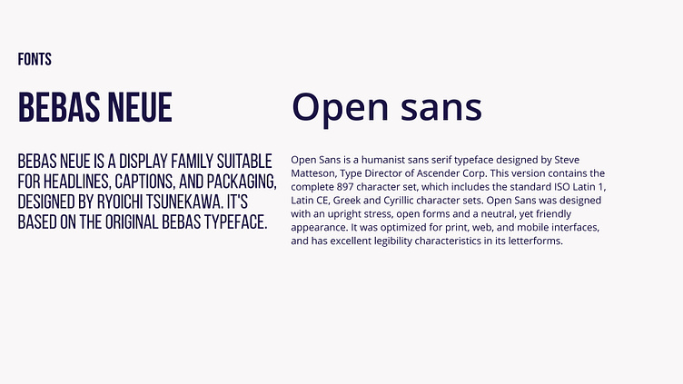
With both mood-boards providing such a visually different appeal, I settled on my colours and fonts quite quickly.
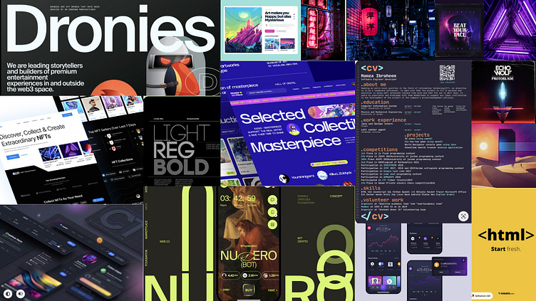
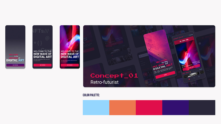
For the retro-inspired concept, I developed a dark-theme to compliment the neon reds, blues and purples so often seen in synth-wave, or 80’s retro-cyberpunk media.
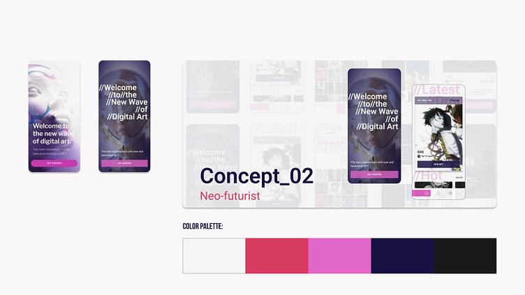
Conversely, for the more neo-tech style design, I stuck to a white/light theme, using off-whites and graffiti reds and pinks, to emulate a more punk-militant-dystopia aesthetic.
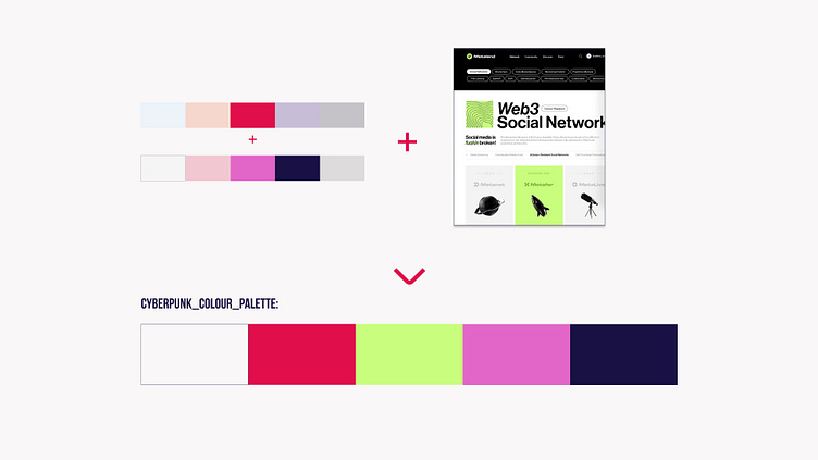
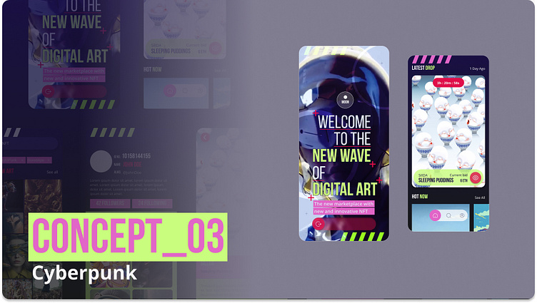
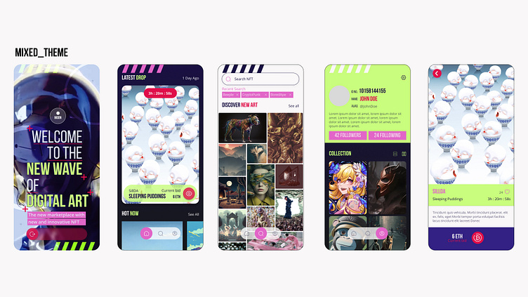
Despite formulating two design styles fairly easily, I struggled to choose one as there were elements from both designs I enjoyed. As a result, I decided to combine the two instead, using a cleaner, and easier-to-read font, and repurposing some design elements to give a maximalist-cyberpunk vibe.
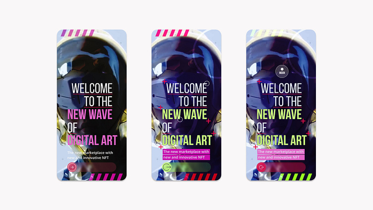
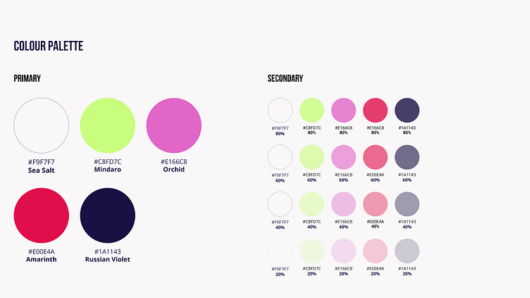
I also recycled colours from both themes, and added a new one that provided a far stronger contrast to the others. This would help highlight aspects of the design more easily, while also allowing for more design versatility.
04_Lock_&_Scale_Design
The_All-in-one
Keeping with the idea of tech and punk, I opted to keep all my CTAs as icons as a means to being more universally understandable. While I approached this from a design-first perspective, I hope it will work from a user-accessibility perspective too.
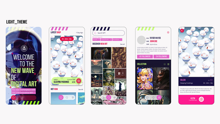
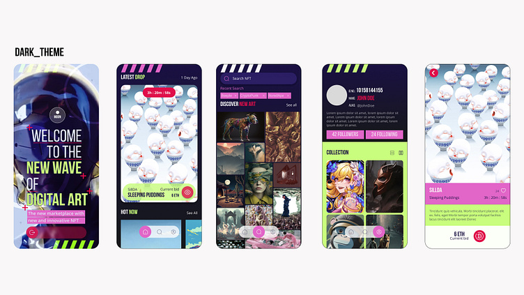
That being said, I was unable to choose between a light, dark or mixed-version of this new design. After asking around, I was told that while the light -theme was far cleaner, the dark-theme provided better legibility and contrast. As a result I opted to go ahead with this one, the upshot being that the dark background would be easier on users’ eyes, in spite of the more brighter elements.
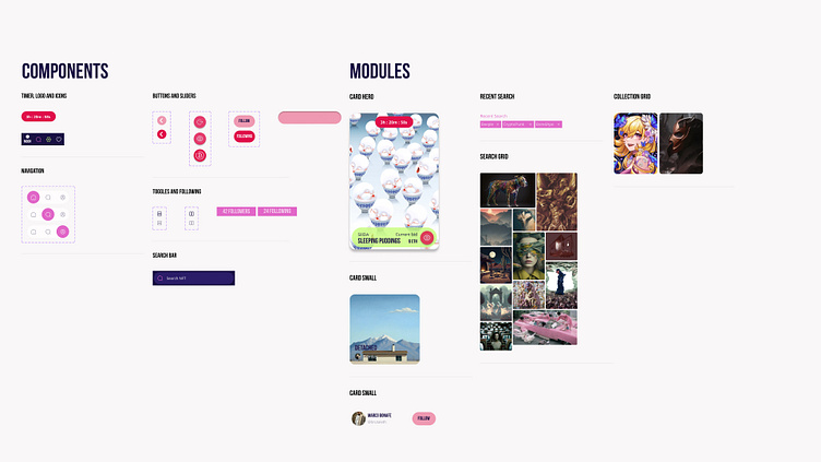
05_UI_Library
The_Aesthetic
Having finally settled on a visual design, it was time to compose and compile the various different elements of the app, including the type and colour styles to help facilitate a smoother, and more efficient workflow, while maintaining consistency throughout the design/creative process.
The UI Library, also known as a Design, Pattern or Asset Library, is a collection of ‘styles’ or recyclable/reusable elements that allow designers to create consistent visual alignment across different instances/screens in an app, or platform.
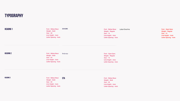
By documenting them, with the necessary properties and information, we can create a design document, or ‘design system’, that not only tracks and catalogues the number of components being created, but provides other designers with a guide of the functional and design choices within the context of this app.
06_Takeaways_and_next_steps
The_Aftermath
Coming from a design background, I found my overall experience on the course to be edifying. I learnt a lot about using a more refined process work-flow and setting up my design library, as well as about the advantages of auto-layout configurations.
My next steps, after prototyping, would be to test the mock-up’s usability and the app’s aesthetic appeal, document the findings and iterate on any pain points/failures in the next version.
In the meantime, why not try out the prototype?