NFT Marketplace - Case Study
The New Wave of Digital Art
Overview
Moon is a new startup with the goal to revolutionize the NFT marketplace business and the digital art scene. This is a place where tech-savvy people can come to buy and/or sell beautiful and curated digital art.
The goal is to create a visually aesthetic design and then scale it across multiple screens, based on the wireframes and flow that was provided by the client. The focus will be to build a UI library and a functional prototype ensuring a deeply curated experience for users.
Concept 1 - Green & Sleek
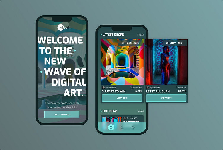
During the research phase of the first concept, my eye continued to gravitate towards green color palettes, large bold typestyles, and sleek layouts. This inspiration created a new and exciting aesthetic, setting Moon apart from the competition of other NFT apps.
Based on the moodboard, I began my visual exploration. My design showcased a large, bold typeface with sleek rounded edges, keeping a "techy" feel. I paired that with bright blue circle elements that I continued to use for headers throughout the design. I initially used sharp corners on all of my elements with intention that it added to the sleek feeling of the app.
Concept 2 - Dark & Neon
My second concept remained more traditional for an NFT app, using bright neon colors and a dark interface. I was drawn to multi-color, large typefaces, as well as the layering and roundness of elements.
While this style was consistent with most NFT apps, my visual exploration created a unique feel with pops of neon color infused in the headers and buttons. The use of shadows and layering created a visual hierarchy to keep the user engaged.
Lock & Scale Design
Moving forward with the first concept of green and sleek, I scaled the design across the remaining wireframes. I ensured the use of the green/blue color palette flowed consistently throughout the design. I took the rounded edge from the typeface and added it to all the components, creating a sleek cohesive feel.
Design System
This UI library is the core of my design. The color palette, typography, grid, components, and modules helped create a scaleable and visually aesthetic design suitable for Moon's up and coming NFT Marketplace app.
Prototype
The prototype is a fully-functioning representation of Moon's NFT Marketplace app, showcasing the final UI design with realistic interactions of it's features. Check out the full prototype here.
Takeaways
This case study was part of Dribbble's Intro to UI Design Course. I was able to take a client brief and turn a concept into a scalable design. I learned the basics of UI design and how to apply them when designing an app interface. I also learned the process of what it would be like to take a brief, research it and create visual explorations, lock and scale that design, create a design system, and turn it into a functioning prototype.
This was also my first experience truly using Figma and unlocking all of it's capabilities. I loved learning how to use the platform properly and efficiently, and I can't wait to continue using it for future design projects.
Credits
NFT Artwork: Elnaz Mansouri


