Eterlique: Case Study
Hi folks! We are finally ready to share with you full case study of Eterlique project.
Scroll down to see more animations and much more content. Don’t forget to check whole story in our Dribbble profile, Instagram and especially Behance!
Eterlique is a young brand
of women's casual wear
We developed a light and feminine design, using tender colors and lots of air. Also we played with the broken grid to emphasize that the brand is not only about minimalism and functionality, but also about personality and uniqueness.
We keep using the broken grid, lots of air and small details in the catalog. Furthermore, we made a smooth animation that brings the minimalistic design to life. At the same time, the animation contains a feminine energy, a sliding forward motion like a modern urban woman going about her business in elegant and functional Eterlique clothing.
Finally, feature pages — product page, cart, checkout, etc. We kept the stylistics, yet made all these pages familiar to the user and comfortable for use.
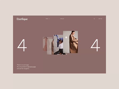
About brand, Contacts and memorable 404 page – in short, pages, that no thriving brand can live without.
We hope you enjoy it! Press "L" if you do 🖤
And as usual we’ll be glad to hear what you think about it in comments, it's really important for us 💭
Team:
Web designer — Margaret Plotkina
Branding — Designpunkt
Project Manager — Olga Krupps
Art Director — Maxim Berg
ㅤ
Made by Sick.
Follow us:


