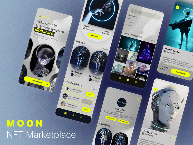
Moon: NFT Marketplace App
Overview
I enrolled in Dribbble's UI Intro course to begin my journey on user interface design, its processes and Figma.
Brief:
To establish a new visual language for a fictitious client MOON, a new up and coming startup with the goal of revolutionizing the NFT marketplace, a space and platform for artists to sell their original digital art with cryptocurrencies.
Deliverables:
Create 2 Moodboards
Create 2 Visual Explorations
Design 5 hi-fidelity UI screens
Develop a UI Library / Design System
Create a functional prototype
Target Audience:
The target audience are for future-forward people who embrace, collect and sell NFT's and digital art. They are tech-savvy and understand how to navigate the crypto world as well as for curious bystanders looking to explore this new space.
Disclaimer: All artwork was sourced through Pinterest and OpenSea and is not my own. They are used for the purposes of student work.
Wireframes
The wireframes were provided for this project so I used this structure along with my own explorations to approach the overall design and flow.
Visual Exploration
With the moodboards as reference, I began to experiment with different concepts and directions as well as explore and learn different Figma visual effects that I found inspirational such as glassmorphism, neon glow effects, noise, shapes, textures, blurs, transparencies, gradients and drop shadows.
UI Library & Design System
As I refined and polished the final direction upon review with my mentor and other students, I began to build a new UI library and design system from the different modules and components.
Final Design
I went with the minimal concept further refining the neutral gray tones to help accentuate and bring out the artist's digital art. A neon green glow button was chosen to create high contrast and to create a more futuristic sleek looking UI.
Prototype
I learned how to prototype on Figma, connecting all the screens and interactive buttons, learning how to set up the different components such as the CTA button for "liking" an artwork and "following" different artist profiles. It was definitely a learning process!
Summary
Learning about UI design took me into a deep rabbit hole with all its depth, psychology, and dynamic complexities and the plethora of resources I was taken to online. It feels like a never-ending infinite realm of possibilities and potentials! I feel like I have barely scratched the surface of user interface and my journey has just begun.
I look forward to evolving this ongoing project by further learning interactive prototyping, auto layout, building a scalable design system and all the glorious powers that be of Figma. This course was a great primer to get the juices flowing as I begin my next class in Product Design with Dribbble!
If you'd like to say hi, contact me or check out my other work, find me at:


