RELIQ A NEW Digital Art NFT marketplace
Hey everyone!
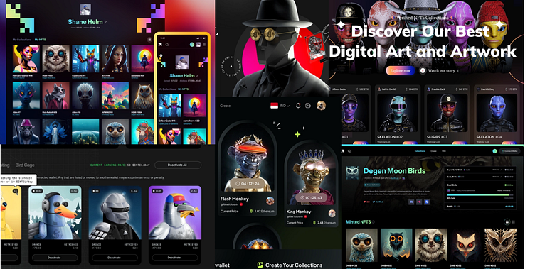
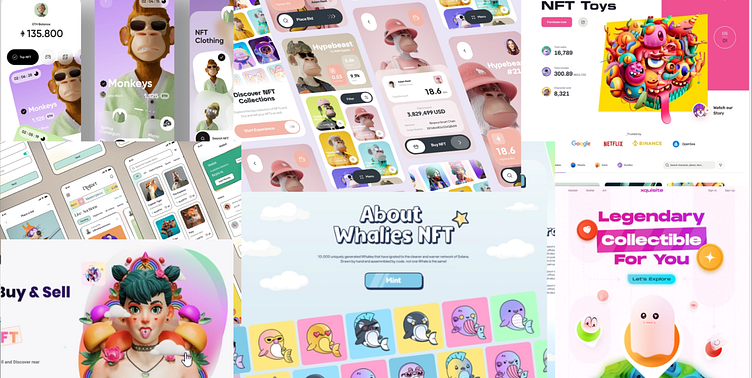
This case study focuses on 'RELIQ', a promising new NFT marketplace that prioritizes a design-forward approach and a thoughtfully curated user experience. The platform features a delightful selection of charming NFTs, catering to fans of all things adorable. To begin this project, I developed a mood board to explore various concepts and visual elements that align with RELIQ's vision. Below are some examples of the visual inspiration that guided the design process for RELIQ.
1. Moonboard & Visual Exploration
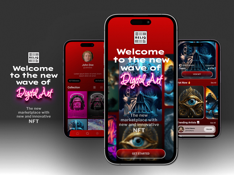
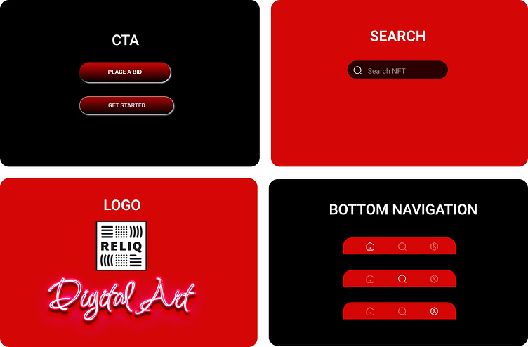
During the second week of the assignment, the primary focus was on building mood boards for two distinct concepts, selecting a color scheme, choosing appropriate fonts, experimenting with iconography, and designing the screen layouts. I had two initial ideas in mind: a sleek, dark-mode app featuring gradients, and a bright, playful app with a cartoonish design. After organizing my two mood boards, I used them as a foundation to create the Splash and Home Screens for each concept. For the first concept, I opted for a gradient design using shades of red, black for the CTA, and a white title. The "Digital Art" in the title features a bright neon design, adding to the brand's identity. To create a futuristic UI, I incorporated rounded buttons, a blurred bottom navigation, and a minimalist hero card. For my second concept, I focused on using vivid, bright colors for the buttons without any shadows. The UI design includes clean backgrounds and square-shaped elements for added detail.
Concept 01
Dark gradient & futuristic design
Concept 02
Bright colors & cartoonish design
2. Polish & scale design
After creating two concepts, we were tasked with selecting one and designing a visual theme for all the provided wireframes.Despite the majority of people opting for the lighter theme, I decided to challenge myself and choose the darker concept. Personally, I felt this was the best outcome for me, as I had been striving to design a sci-fi inspired and mysterious interface for some time.
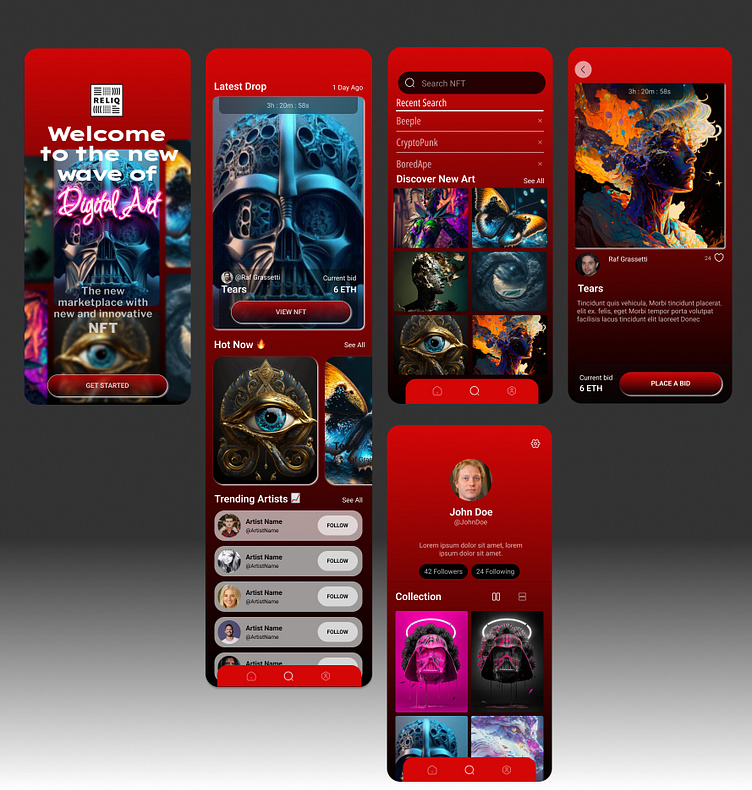
2.1 Home screen exploration
For the Home Screen, I wanted to have a different approach from the wireframe. I put the brand name and logo on the top of the main hero card I picked for the home screen. This is to emphysis the brand name for customer to have more impression on the brand. The CTA buttom in gradident red to match the theme color.
2.2 NFT screen exploration
When designing the NFT Screen, my aim was to maintain the same structure as outlined in the initial wireframe. However, I experimented with the design and decided to increase the size of the image. To ensure the screen remained clean and easy to read, I split the information into two smaller sections.
3. UI Library
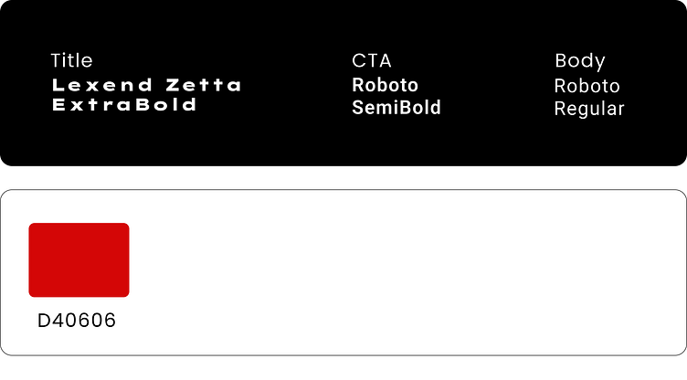
Typography played a crucial role in the UI design, and I began the process by researching various sans-serif fonts. After careful consideration, I ultimately chose Lexend Zett for the titles because it provides a sci-fi, technological aesthetic.
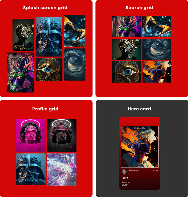
To keep the components simple, I mostly followed the original wireframe. The modules have a playful and fun appearance due to the colorful images and alignments. In addition, the simple yet clean typography combinations make the cards easy to read, with a focus on the core information.
Components
Modules
4. Final thoughts
After completing Daniele Buffa's Intro to UI Design course, I am filled with a sense of pride. As a newcomer to this field, I had the opportunity to learn a great deal about the industry and product design, with a particular focus on UI fundamentals.While I still have areas in which I can improve, I feel more confident than ever in my decision-making ability thanks to my newfound knowledge of building visual app designs. This course taught me how to approach and explore ideas, create concepts, polish designs, build a UI library, and be more open to prototyping.I owe a special thank you to @Kristina Volchek for her weekly mentoring sessions and feedback on my assignments. I learned far more from these sessions than from the video courses.Overall, I am thrilled about my future as a fresh product designer, and I feel grateful for the opportunity to have taken this course.
