Anchor - Real Estate Brand Guidelines
Hello everyone! 👋
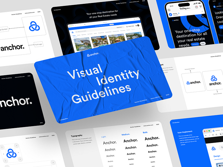
Here is my new exploration of Anchor - Brand Guidelines.
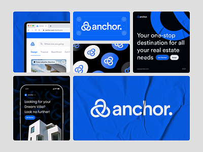
Anchor is just like AirBnB but with a next level next level. A key part of our work involved the design of a new user experience. Following the principle of an aesthetic preference and a high focus on maximising usability and accessibility allows us to create an experience that unites flexibility, efficiency, and aesthetic values.This is the visualitation of how the logo implementation looks like.
Our logo is a powerful symbol of our brand and we ensure it's implemented in a way that reflects our values. With a clean and simple design, it's easily recognizable and memorable. We ensure it looks great across various mediums and adapt it to suit different contexts and audiences. Ultimately, our logo is a reflection of our commitment to excellence and building a trusted brand.
Scroll Down for Awesome Preview! Cheers! 🤙
Interest to partnering with us?
Say hello at hellodama@odama.io or visit our website odama.io
Check us more at:
📷 Instagram | 🛒 Gumroad | 🎉 Figma Community | 🛍 Creative Market


