Amano Olive Oil Branding & Packaging Design
Why do you think we used a soft, customized sans-serif typeface for the logo🤔?
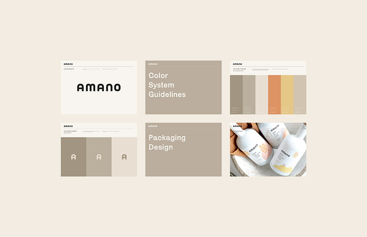
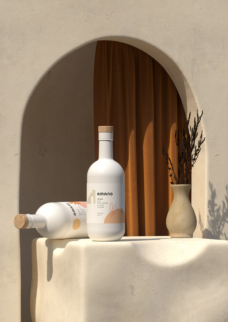
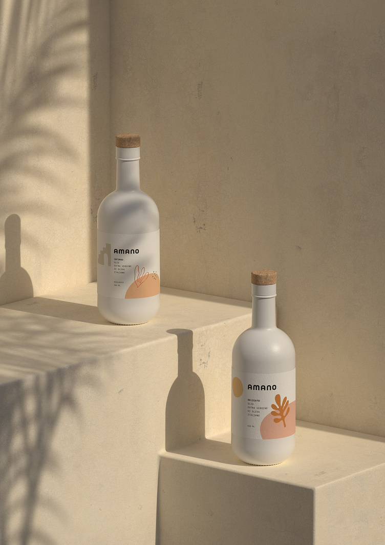
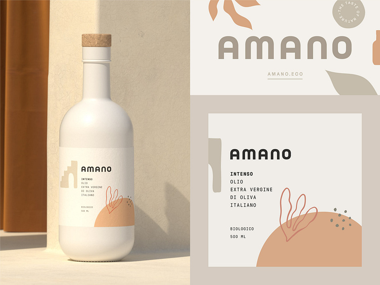
Amano is an olive oil and balsamic vinegar brand from Germany🫒. To convey the brand's strong and natural side, we used a bold, soft-edged sans serif typeface with A's reminiscent of ancient arched top entry doors🚪. This reminder is associated with the name of the brand "Amano," which means "handmade"🤙🏻 in Italian, as in ancient times, before we had machines, everything was made by hand.
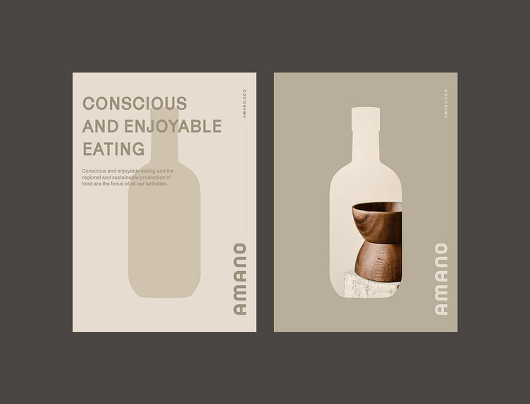
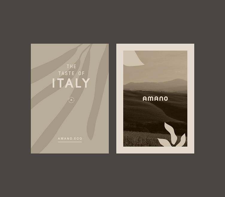
Meanwhile, we maintained the clean and minimal design of the labels and packaging. In order to avoid a dull white label⬜, we created minimalistic illustrations associated with natural products🌿.
Let's work together!
— Do you have a project? 📩 projects@markaworks.com
— Visit our website to see all the project presentations.