At the centre of excellence
Core Fund Services (Guernsey) Limited (“Core”) is the dynamic new provider of fund administration services for the investment fund industry of the future. A great full suite project of brand, animation, digital and print collateral designed to support their vision.
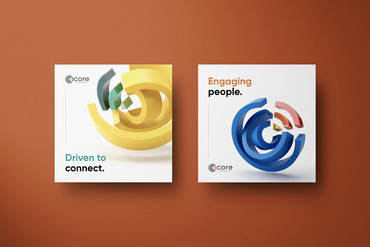
The brand icon was developed to suggest both the company initial and the idea of a central core. The radiating circles draw the eye to the heart of the marque where a wedge-shaped section embodies the letterform and suggests the idea of direction and focus. This is a brand that is all about clarity and focus, suggesting a strong and uncluttered approach.
An unapologetically bright and bold use of colour with the logo marque created scope for developing core themes with the use of 3D modelling, further enhanced in motion design.
Expanding on the core theme, a series of messages were developed to reflect acts to the outcomes, or reveal identifiers to the attributions, allowing a focus on either results or positive traits. In some cases combining a sense that the outcome is naturally built in, adding to the weight of the messages and the link back to 'core'.
The website keeps things vibrant and succinct with bold use of animation and continued use of the bright colour suite.


