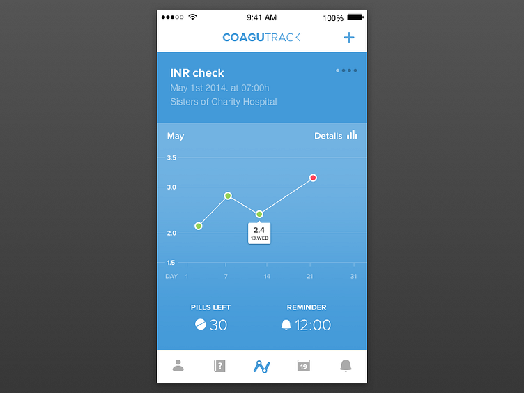
Dashboard v2
I've decided to make some changes on dashboard - added new icons and the blue theme. The INR graph occupies larger part of the screen therefore user can read the data more accurately.
I would like to hear your thoughts.
More by Luka Perić View profile
Like

