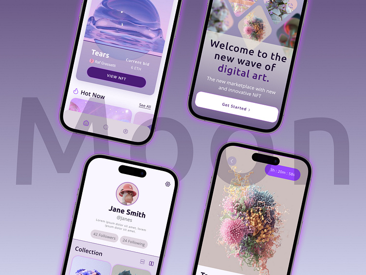
Moon: a NFT Marketplace Neon Concept
Dribbble’s Introduction Course
I enrolled in Dribbble’s Introduction to UI Design Course furthering my design education. Our final project was creating a new NFT marketplace app, Moon. We received an initial brief and got to work establishing visual language, creating mood boards and executing a number of screens. After nailing down a final design scheme, I scaled the design using wireframes provided by my client.
Brief
The client is Moon, they're a new up-and-coming startup with the goal of revolutionizing the NFT marketplace business with a design-first approach and a deeply curated experience for the users.
Mood Board
Beginning with a mood board, I started the journey to make Moon. My inspiration search brought me to two very different places; one more nostalgic theme and one glassy neon-purple. This was a great exercise; I learned so much through this process. Through many rabbit holes and screenshots, I ended up choosing the glassy neon-purple theme to dig into more. The soft gradients, neon backgrounds, and white cleanliness were the direction I went.
Visual Exploration
After the mood boards were made, I set out to make two screens out of the wireframes provided by each mood board. These four screens were the first part of the journey about to unfold. It’s fun to look back and see none of them is the final screen!
Glassy Neon-Purple
Nostalgic
Why This Direction & Scale
I really enjoyed the purple and neon vibe. As I did my research I channeled the soft neon glows, and rich purple CTAs. I thought it spoke more to the space name of Moon and wanted to take off from there. The wireframes that were given gave a great skeleton for creative exploration.
Scaling
Once the direction was decided and the wireframes in place, I got to really get into playing with designs and testing out all sorts of ideas. Making small adjustments to each screen until landing on a final design.
The slightest design changes sometimes make a huge difference. Once the final screens were made it was time to grab all those little components to make the design library. Having a well-thought-out, organized design library makes mass-scaling your project so much faster.
Final Designs
Summary
In the end, I'm happy with how my final design turned out! I learned a lot from this process and hope to do more exploration like this in the future. This project was my first app attempt and am please with the end product.


