Mind & Body — UI/UX
Mind & Body Health Partner — UI/UX
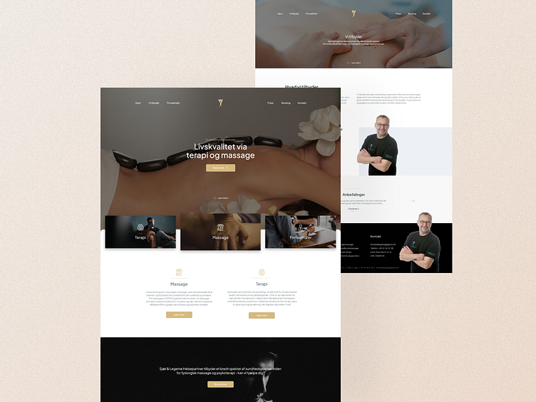
Hey everyone! Check out my latest UI design project for Mind & Body Health Partner. I've used luxurious golden colors and high-quality images to create a relaxing and inviting atmosphere. Here's a quick overview of the design.
Color Palette 🎨
I used a color palette of golden hues to emphasize the high-end nature of the brand. The color palette is inspired by the feeling of luxury and relaxation. Golden tones are used throughout the design to highlight important elements and create a warm and inviting atmosphere.
High-Quality Images 📷
To create a relaxing and calming vibe, I've used large, high-quality images of health and wellness-related activities. This helps to reinforce Mind & Body Health Partner's focus on holistic health and wellness.
User Interface (UI)
The user interface is designed to be simple and intuitive, with clear calls to action and easy navigation. I wanted to create an interface that would help users easily book appointments, browse services, and learn more about Mind & Body Health Partner.
The design is also responsive, ensuring that clients can access the website on any device. This allows for a consistent experience, no matter where or how clients access the website.
Final Thoughts
Overall, I'm really happy with how this project turned out. I think the golden colors and high-quality images work together to create a luxurious and inviting atmosphere that aligns with the Mind & Body Health Partner's brand.
Let me know what you think in the comments below and feel free to reach out if you're interested in working together on your own UI design project.
Wanna work together?
Send me a mail on andreas@katzmann.dk 🤙


