Anchor - Accommodation Marketplace 🔥
Overview
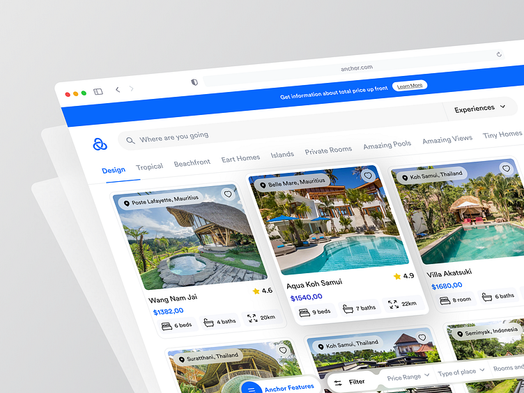
A key part of our work involved the design of a new user experience. Following the principle of an aesthetic preference and a high focus on maximising usability and accessibility allows us to create an experience that unites flexibility, efficiency, and aesthetic values. The dekstop application had to display all the information the user would find on the mobile app. To achieve this, we went for a simple and clean approach that adheres to our sophisticated design standards.The result: an optimised user experience to have on-the-go.
The Challenges
Anchor approached AirBnB agency to help them stand out from the crowd and create a more memorable brand experience. Initially, we need to make the filter field to be a bottom of the navbar and combine it with the menu bar. The second one, the design banner is still not prominent enough. And what’s left is the card for real estate, we have to make the price more attractive by users by adding real estate facility information.
The Solutions
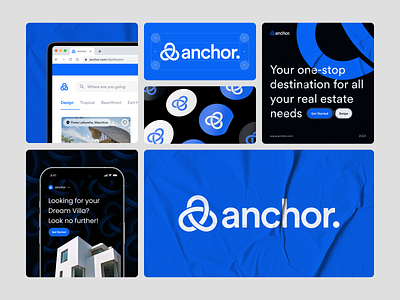
Synthesizing our customer research and usability data, we defined a series of key insights for AirBnB and recommendations for improving the overall user experience based on the challenges we face. Make it easier for users to find the right accommodation by simplifying the search filters and sorting options. Designed a new visual identity for all touchpoints.
Interest to partnering with us? Say hello at hellodama@odama.io or visit our website odama.io
Check us more at:
📷 Instagram | 🛒 Gumroad | 🎉 Figma Community | 🛍 Creative Market


