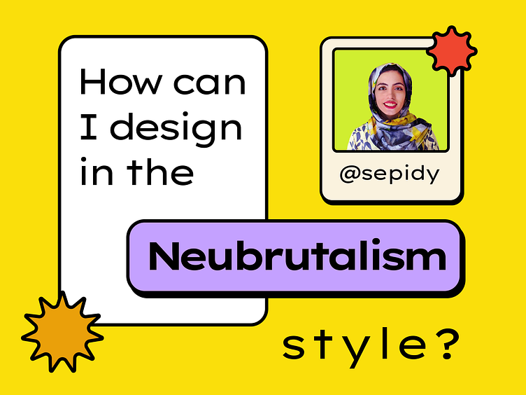
Neobrutalism UI (How to)
TL;DR:
There is a cheat sheet at the end!
So I’ve been seeing Neo — Brutalism designs everywhere for a while, I read a couple of articles and saw multiple examples, and videos to learn some basics. This is a summary of what I’ve learned during this process. You can find the complete article here. Hope you find it useful!
What is the difference between Neo-Brutalism, Brutalism, and Minimalism?
Color
Black: In Neo-brutalism, we use pitch black with no fear! The two most important use cases of black are strokes and dark shadows.
Background color: In Neubrutalism, we can use multiple colors (other than white and light gray on light mode and dark colors on the dark theme) for the background color! We can use very vibrant colors, and vintage and muted colors.
Vibrant colors: You can use colors with high saturation.
Vintage and muted colors: You can imagine you are designing an old magazine or poster and you can use all those colors too.
No gradient: As far as I saw there are no examples of using gradient in this style. Colors are distinct and don’t have different tones and gradients.
Components
Raw, unrefined shapes like circles, rectangles, stars, and polygons with strokes. (Basically, these are shapes from Microsoft Paint!)
Spaces are defined with lines and cards and cards have strokes and black shadows.
Drop shadows have both X and Y, no blur, and the color is black with the 100% opacity.
Decorative components like moving banners, images with background and stroke, and illustrations.
Typography
Sans-serif is still more popular in this style.
Large font sizes for headings.
Experiment with line height and letter spacing.
Typography is a decorative element, especially on websites
Here are some example fonts: Lexend Mega, Public Sans, Mabry Pro, Archivo Black, Bebas Kai
Cheat sheet
You can find the complete article here.
Examples
FigChallenge is a web app that designers can join or create design challenges there.
It was one of my designs that many designers told me to build it and now it is launched. It is a new product and I chose this style to better elaborate this newness! You can read more about it here.
We are accepting people only from waitlist!
So secure your spot NOW!
Here's a link to a personal website who used the neobrutalism style🤩


