NFT Marketplace App Design
Project Overview
Design brief
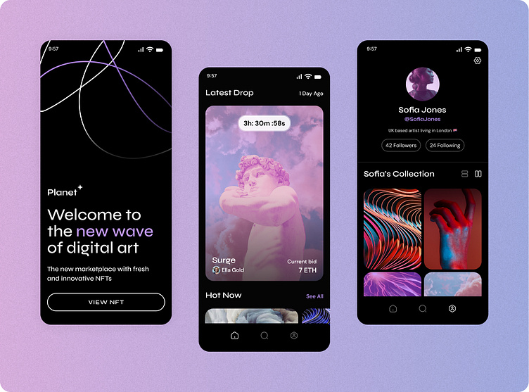
Planet is a new app aiming to transform the NFT marketplace with a design-centric approach and a carefully curated experience for its users. Their target audience comprises mainly of tech-savvy Millennials and Gen Z who are familiar with cryptocurrencies and NFTs. However, the product must also be appealing and easy to comprehend for those who are new to the NFT space.
Scope of work and results
Planet envisioned a visually striking aesthetic that would resonate with the market while also introducing something novel and disruptive. The project consisted of conducting research into the NFT market, creating a brand identity and logo, colour and typographic styling, and designs for the app prototype including the splash page, home screen, search page, profile page, and art page.
Mood Board Research
To conduct visual research, I examined various NFT marketplace apps and websites. Additionally, I drew inspiration from more conventional art spaces like art galleries and museums.
Visual Exploration
I experimented with different design concepts, including a dark, sleek aesthetic as well as a light, contemporary feel. After careful consideration, I found that the dark, sleek design had a more compelling visual impact, and decided to focus on this direction for further exploration of the app screens.
Wireframes
Wireframes were created to establish a basic layout for the app pages, including the splash screen, home screen, search page, profile page, and art page.
Locking & Scaling The Design
Once the preferred visual style was selected, the aesthetic was then applied across multiple app pages to maintain consistency and establish a cohesive brand identity. This involved considering factors such as typography, colour palettes, and imagery, while ensuring that the visual elements worked together harmoniously to create an engaging user experience.
In addition, the scaling process required careful consideration of how the aesthetic would translate across various screen sizes and resolutions. To ensure optimal usability and accessibility, I conducted extensive testing on different devices and platforms to ensure the design remained effective and visually appealing across the board.
Overall, the scaling process was a crucial component in creating a successful NFT marketplace app, as it allowed for a seamless and engaging experience for users while upholding the brand's visual identity.
UI Design Library
Key Takeaways
As a newcomer to the NFT marketplace, I found this project to be an exciting opportunity to delve into a burgeoning field and showcase my design skills. To accomplish this task, I utilized Figma, an intuitive and user-friendly design and prototyping tool that allowed me to seamlessly create and scale designs.
During the design process, I aimed to strike a balance between a polished aesthetic and millennial-inspired colors and textures. By incorporating subtle yet visually compelling elements, I am confident that the app will appeal to both novice and seasoned NFT buyers, providing a streamlined and intuitive experience for all.
Overall, I am thrilled with the outcome of this project and believe that the resulting app has the potential to revolutionise the NFT marketplace industry by offering an innovative, design-driven approach to navigating the space.


