Unicity Enroll
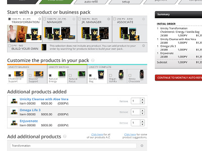
It was important to focus on greater visuals and calls back to product branding for the enrollment process. Also, simplifying each step to smaller steps made the process and decisions more consumable—including reducing the number of steps in the process. Carrying these same conventions throughout other steps of the application (like a monthly automated refill) made the entire experience more understandable and yielded fewer surprises. One of the greatest discoveries in this process was that we needed to invert the organization of this step from displaying 10 options and the 4 levels of each of those options, switching to focusing on the 4 levels and allowing every product available at this step. Simplifying the options and opening them up to accommodate a wider audience and their needs.
