Case Study — NFT Marketplace App
What is this project about?
The fictitious client was creating a NFT marketplace and hired me to establish the visual language of this new application, define a visual aesthetic and scale the design with the wireframes provided by the client.
The primary audience for this application is Web 3 savvy tech people, artists, and curious NFT enthusiasts.
The timeframe was 3 weeks, starting with the research, continuing with the mood board creation and initial visual exploration, and finishing with locking the visual aesthetics, scaling the selection, and creating a UI library.
Deliverables
A new visual language
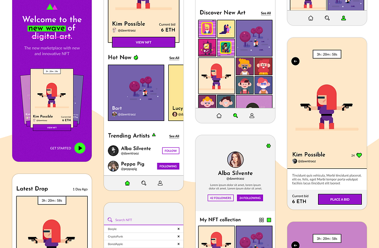
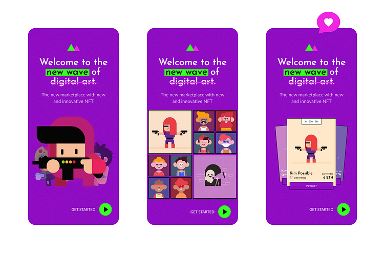
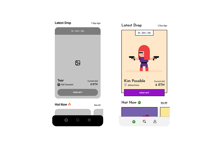
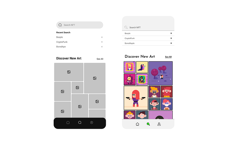
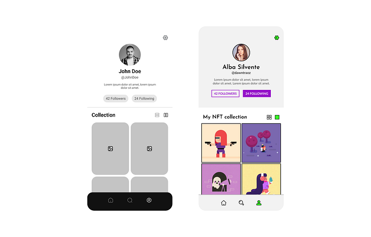
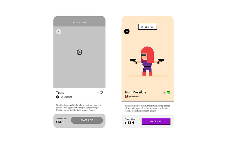
5 screens → Fully designed flow in High Fidelity
Color & typography system
UI library
Functional Figma Prototype
My responsibilities
As the UI designer of this application, my responsibility was the creation of the requested deliverables, emphasizing the initial research and doing User Research throughout the process to define a correct visual direction for the project.
Once the direction of the visual appearance was defined, part of my job was to make it scalable, prepare several screens with the previously defined structure, and prepare a working prototype, both of the final design and the library, to create a common language between teams and leave a guide of how to work with all the elements in the future.
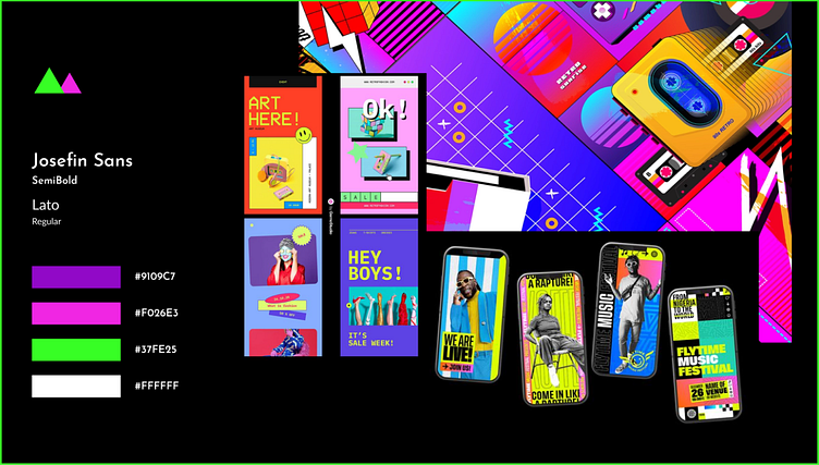
Moodboard
In this mood board, I wanted to find a unique look, a 90s & retro style, with video game touches and punk details. I started looking for references with straight edges, intense and bold colors, hard and striking typography, and pure whites/blacks.
Visual Exploration
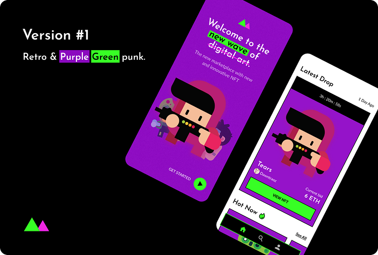
Initially, I explored different options guided by the conclusions of the mood board, playing in the first versions with black and white for the bulk of the app and then focusing on the primary colors purple and green, giving it a more punky vibe to represent better the visual aesthetic I was looking for.
Once I chose the Splash Screen with which I wanted to continue exploring my application, I defined a homepage with the same visual aesthetics.
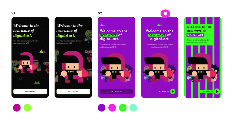
Although I was happy with the result, there was something that didn't convince me. It was here, thanks to User Research, that I found a more pleasing aesthetic that better matched the style of the illustrations that would appear in the application.
Lock & Scale design
From the new aesthetic direction, I started to explore the rest of the screens and define a scaling process. As I progressed in the wireframes, it was easier to follow the guidelines of the previous ones.
UI Library
App Prototype
What I have learned
When I did this project during the Intro to UI design course at Dribbble, I learned how to take a concept or idea to implementation. As a frontend developer, I had always gone from idea to code without going through some previous steps of inspiration, research, and exploration that I see as essential for an optimal result.
Also, the part about making the design scalable was very constructive, and I saw the similarities with my work in web development. I take away with me an incredibly motivating experience and the hope that we developers will start to value the work of designers more!
Thanks to our mentor Natalia Veretenyk for accompanying me and giving me guidelines and tips to improve my result. And to my boyfriend for complaining when something didn't convince him and making me think about it differently xD