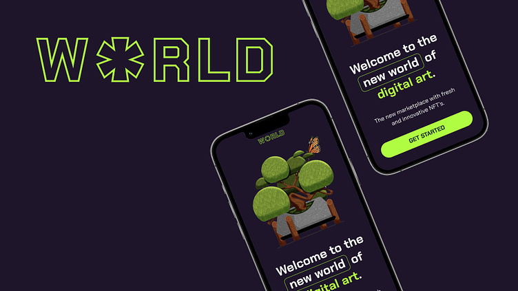
World: NFT app design.
As part of Dribbble's four-week UI Design course I have explored the beginnings of UI design and spent time designing a mock NFT Marketplace App.
Brief
The client is World, they are a new up and coming startup with the goal of revolutionising the NFT marketplace business with a design-first approach and a deeply curated experience for the users. The goal is to design an app based on the wireframes and flow provided by the client and maximise engagement from their audience.I will achieve this through research, visual exploration, branding and using feedback sessions to improve the design and user experience.
Moodboard
To kick-start the project, I focussed on two areas of visual research in order to begin designing the visual direction. The left hand mood board takes inspiration from calmer, more colourful places and the right hand mood board took inspiration from today's digital trends and colours.
Visual Exploration
As a result of collating the two mood boards, I designed two potential routes to guide the visual direction of the app. The left hand direction was supposed to exude a serene vibe with clear navigation, more aimed at an older sophisticated user. And the right hand direction was designed to appeal to a Gen-Z audience in colour, tone and typography.
Final Concept
I based the UI on the wireframes provided and on my initial visual exploration. I created type systems, libraries, components and modules to then build a prototype that visualises the functionality of the app.
My findings: The process of building the app in Figma was very informative and enjoyable and I learned how to make usable graphics that are scalable and practical. I intend to coninue to develop these skills in the future. I believe World fulfils the brief, creating a digital NFT marketplace that would appeal to the target audience. Illustrations courtesy of Jordan Cheung.


