Burton Sustainability Identity
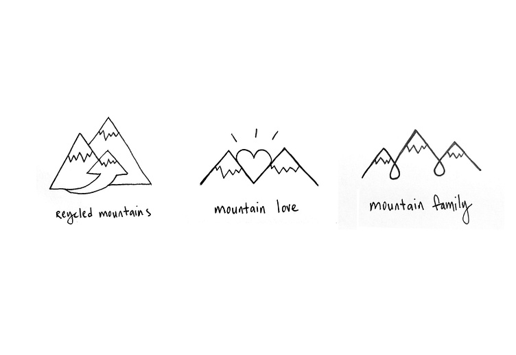
Initial Ideas / Sketches
While working at Burton Snowboards, I was tasked with coming up with an identity for a new company initiative – sustainability. Because Burton's culture started and depends on mountains, I wanted to use mountains as the primary part of the identity.
Below are some of my first sketches. I was inspired by the culture at Burton around family and a shared loved for mountains.
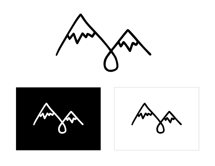
Revisions
The feedback from my creative team members was to push forward with the sketch on the right that showed a water droplet as a link between the mountains.
Below are a few of the logo marks I presented for the next round of feedback.
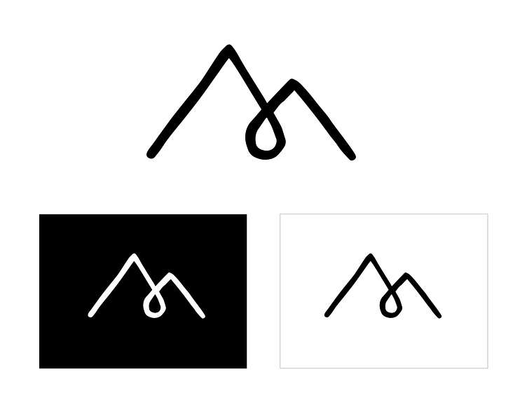
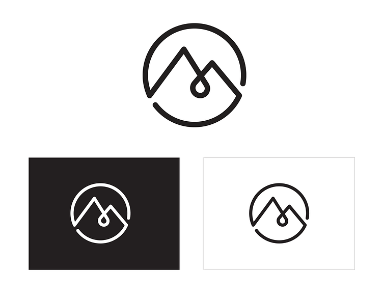
More Revisions
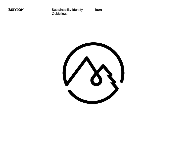
The next round of team feedback pushed me towards trying to show the cyclical process of reusing & recycling. The logo below shows how I put the mountains & water droplet inside a circle to show reuse & recyle.
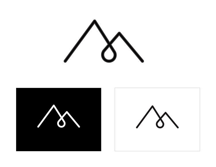
Legal Feedback
Oops. The logo above was too close to a trademarked logo for a brand based out of Canada. Our in-house legal team at Burton, said I had to edit the logo.
While it was frustrating to learn that I needed to make yet another revision, it ended up giving me the extra push to add a third element to the logo. I was able to edit one of the mountains to be an evergreen tree. Below is the final identity guidelines distributed to the company.
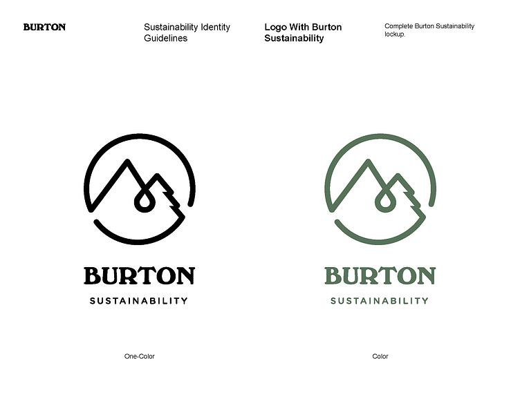
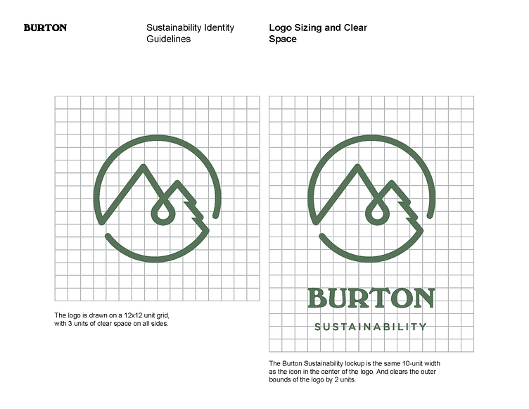
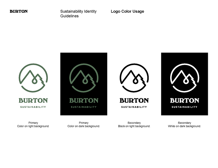
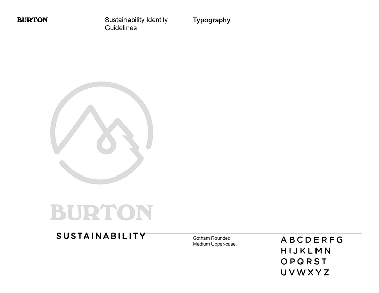
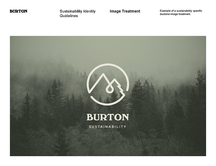
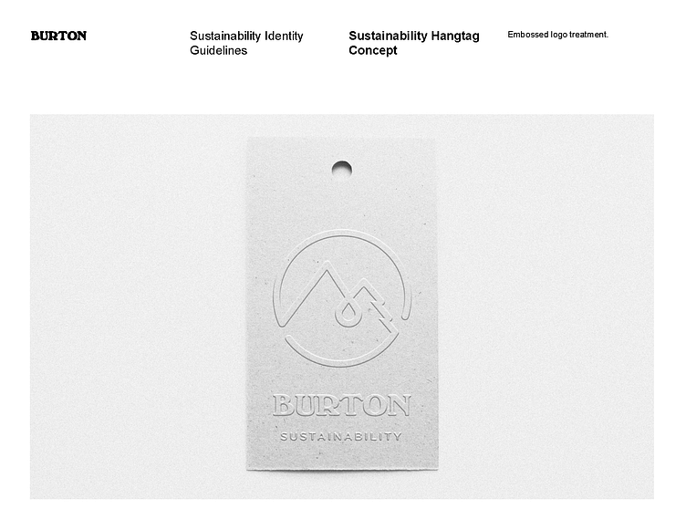
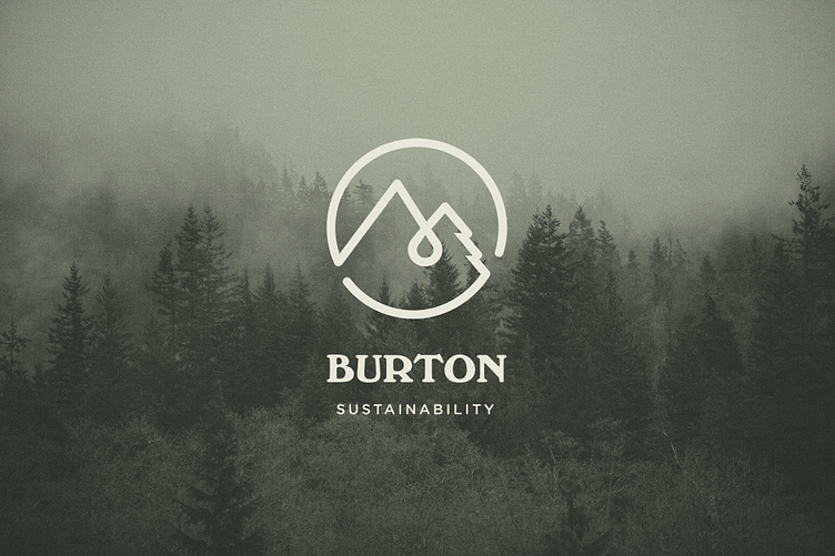
Final Identity Guidelines
Below are the final guidelines for the logo & color usage.