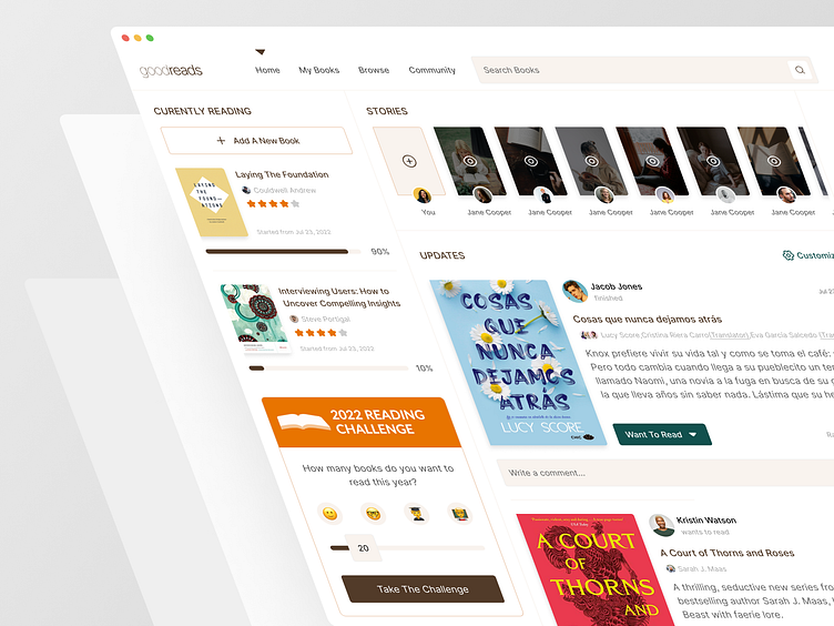
Home Page - Goodreads
Hey Dribbblers 🙌
Long time no see ✌
I’m going to share with you another screenshot of our case study which my colleague Mahya and I worked on,
We tried to design a clean and consistent user interface based on the existing typefaces and color palette, to provide a pleasant user experience for Goodreads users. We will share the entire case study on our Behance page.
Press "L" if you like it, and I would love to know your opinions about it! ❤
We are a Canadian design agency that helps startups and growing companies turn ideas into exceptional digital experiences. We can help you with every design need: UX/UI, 2D/3D illustration, branding, animation, you name it.
Need help with your design? Drop an email to design@duxica.com.
More by Duxica View profile
Like

