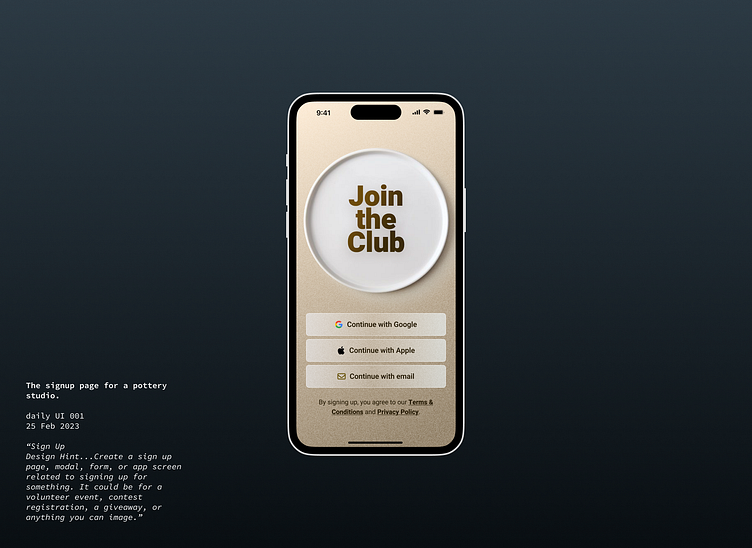
Daily UI 001 - Signup for a pottery studio
First day of the daily UI challenge from https://www.dailyui.co/ . I tried to do the sign up page for a pottery studio. Not too happy with the result, it feels too disjointed in my opinion.
I wanted to used good imagery as the centerpiece because seeing cool pottery pieces sparks the imagination and motivates to join ("I want to do that too!"). I used noise to recall the physical aspect of pottery and the importance of texture.
I tried to use transparency with the buttons to avoid having a flat interface.
Composition was a struggle on this one. (where to place the place, what size should the title be?)
The Font is Heebo.
More by Laurent Grima View profile
Like
