Design System for a SaaS B2B startup

I created a design system for the marketing department of an e-com B2B SaaS startup. As a lead designer, I worked on the design part of the project mostly by myself, collaborating with the rest of our cross-functional team (junior designers, content and project managers, director of marketing, copywriters, video editors, and developers, sales colleagues) on the general direction of the project and non-design related tasks (e.g. writing the brand identity overview, messaging guide, etc.). The main challenge of this project was creating a scalable working design system while also not overdoing it, as this was done for a startup that does not need a huge design system extending to a million pages and a billion components.
Results:
• improved the consistency of the materials produced, leading to increased brand awareness
• raised the team KPI by at least 20% due to faster work
"Loved the update, @Alexandra Mosnitska, and I'm so excited to see this project nearing completion. It's such an upgrade from our old design guidelines, and the potential of the design system and component library to speed up design and development will pay for this project many times over."
"Just watched your original video as well as the update @Alexandra Mosnitska. This is super exciting! Totally can see how it would save immense amounts of time, thank you for sharing!"
Background
Amber Engine is a B2B company with a SaaS product, and I am a part of their team since April 2021. During the past year, we have created numerous pages and worked on numerous UX issues on their website, managing to greatly improve it overall. However, one problem always kept reappearing, which was inconsistency. Every separate page we worked on looked relatively good, but the website as a whole had significant design inconsistencies throughout.
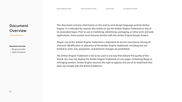
The marketing department of the company consists of a cross-functional fully-remote team of individual contributors, and the set of contributors tends to often change. However, there was no standardized design system, and the existing style guide was very outdated. Therefore, there was no single source of truth for the design team and no proper guidance. Noticing the inconsistency issues reappearing, again and again, I have pitched the team with the proposal for creating the design system. It was then my job to creatively direct the updated brand look, organize it into a design system, and document the guidelines.
Project Goals
• Define the brand look: Define the general creative direction for all the brand content to ensure consistency.
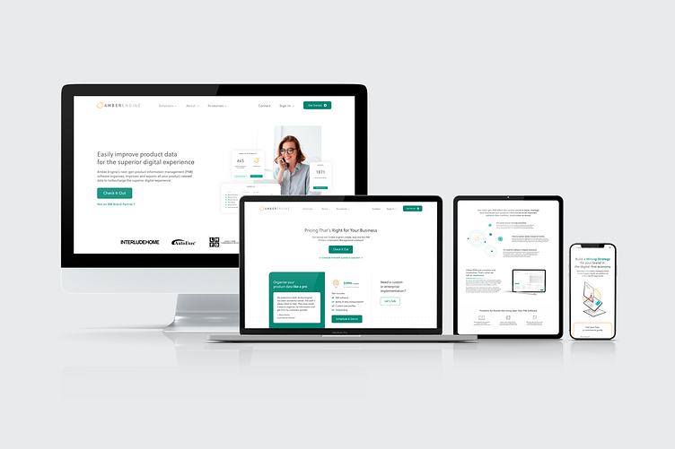
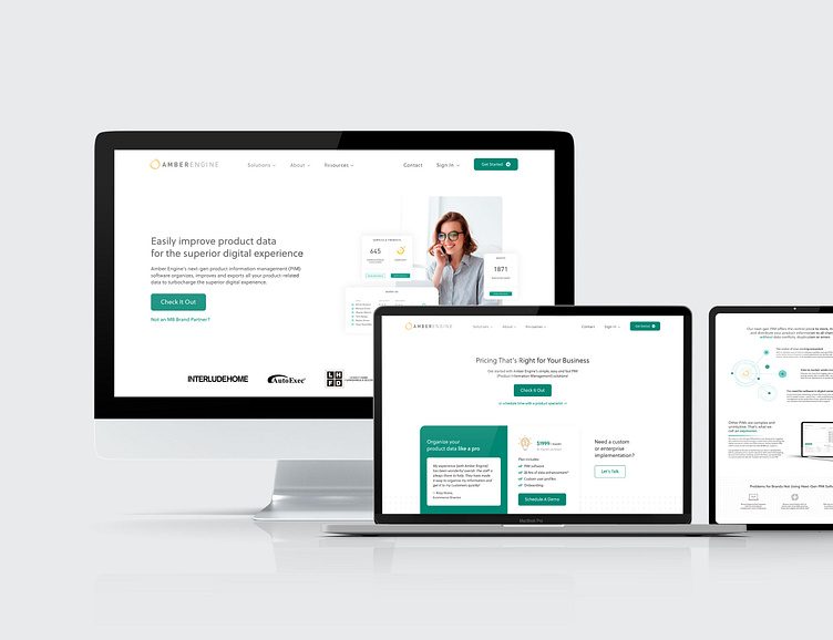
• Unify the website: Set standardized rules for the design of web pages, and a consistent set of components to be used.
• Raise design & dev team KPIs: Create a fully usable and scalable design system in Figma to speed up the process of web design.
• Inspire collaboration and better understanding between teams: Develop a document that would be available and useful for all teams who participate in content creation.
Design Process
I pitched, planned, and executed the creation of the Amber Engine Design System. The process of work on the project included the following steps:
• Discover — Audit and analyze the current situation, find out what the main problems are and what led to them;
• Explore — Create a defined direction for the project and the brand;
• Define & Design — Find the solutions and apply them to the real scenarios, design updated pages, design components, and collaborate with the developers to create code;
• Document & Deliver — Document the design system, set standards for maintaining and updating it.
Solution
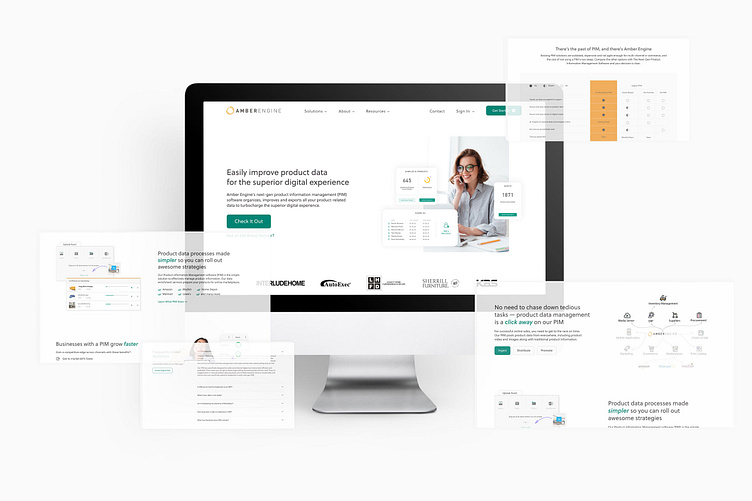
The first phase of the project consisted of a thorough analysis of the current situation to detect what exactly are the problems and why they happened. I inspected the variety of the designs created during the past year and realized that the biggest problems laid in:
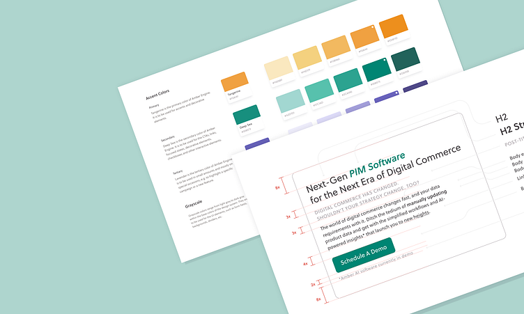
• Type scales (different fonts and sizes everywhere);
• Grids (different margins and layouts on the web pages);
• The overall creative direction (e.g. the shadows were used randomly which created different effects on different elements, the photographs chosen were not always in the same style, some designs appeared very playful while others were very conservative and classy).
The issue occurred because the company had an outdated branding guidelines file, it was obsolete and not extensive. It did not have any info on the design standards for the website design, nor on the overall brand aesthetics. Every new piece of content was heavily affected by the subjective opinion and ideas of whoever was designing it. The consequence of these problems was that the website did not look neat and professional, which was undermining the trust of the potential customers and prevented them from buying the product.
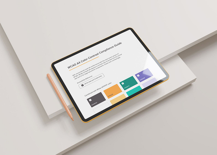
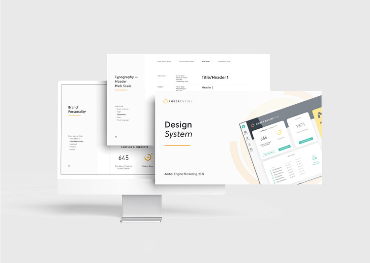
The design system was to consist of 4 main chapters: brand identity guide, communication guide, style guide, components guide & library, and a separate accessibility guide. This volume of content would ensure consistency between and throughout all types of content, as well as generally help new team members feel the vibe of the brand. Now, my job was to visually design that vibe, and I proceeded with the exploration of the creative direction for the brand, and its general aesthetics. I started thinking if Amber Engine was a person, what kind of a person it would be? After a while, I reached a decision of combining minimalism, elegance, and softness in our branding, while also including some bright accent elements and just a tad of quirkiness.

The final new look of Amber Engine was designed based on the following:
• First of all, Amber Engine is a B2B brand. Their primary audience is mostly C-level management, and their website is mostly an informational step to purchasing the product on the customer journey map. This calls for conciseness and minimalism – we should not distract the user with too bright, too eccentric design + the website needs to look professional and clean to be trustworthy. Moreover, as the branding is based on a light theme, it would be very easy to create an inconsistent and dirty look by using too many different colors and graphic elements.
• The softness of the visual elements was inspired by (1) the fact that the logo of the brand has a circular glyph, which calls for adding more round elements into the designs, (2) the general UX/psychology principles stating that soft, rounded elements create more trust in users rather than sharp elements.
• The bright accent elements reflected the values of the brand and the product, as in “easy and fun to use.”
The team promptly agreed on my vision of Amber Engine, and I then translated that vision into detailed guidelines and components.
Upon completion, the design system was documented through 3 main touchpoints (Asana task, pdf document, and a Figma file), and the protocol was created to ensure that it is benefitting the company and remains a live organism that is constantly evolving but will not be requiring too much time for maintenance and updates.