Cubicat (UI Design Class Case Study)

A new Silicon Valley startup called Moon has raised over a billion dollars on the premise that too much blockchain technology has focused on Shiba-Inu dogs and monkeys. The market for those interested in feline based NFTs is completely untapped.
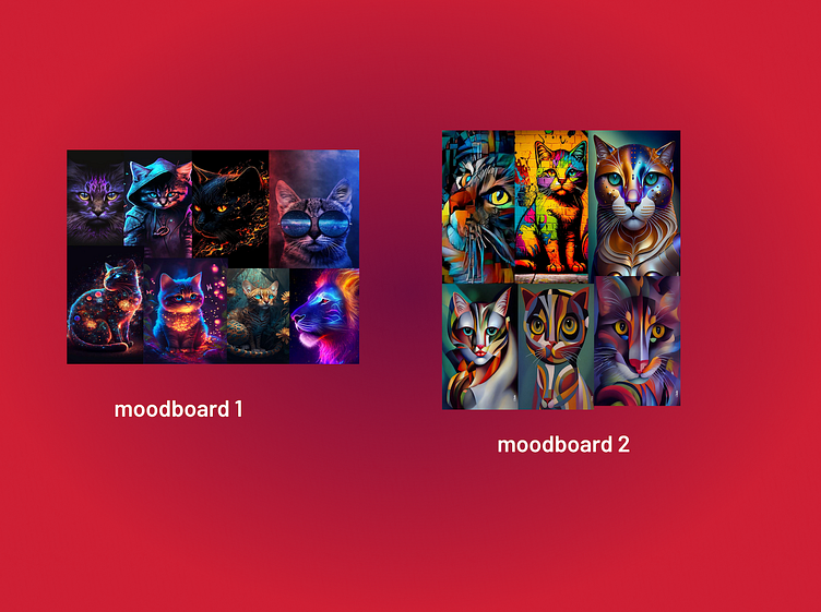
Moodboard
Visual exploration started with the creation of two moodboards. Pinterest was used for its wide variety of artistic cat images and ability to find similar images. Two directions were explored. The first invoke darkness, space, fantasy, magic, and fire. The second was tribal, cubist, abstract, and colorful. The tribal and colorful theme was chosen because of its association with the modern art movements such as cubism and abstract art.
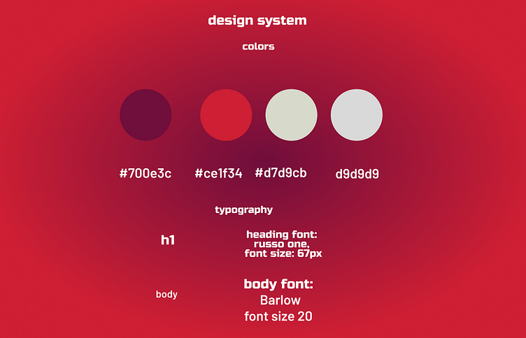
Design System
The color system was selected with AI color palette generator Khroma. The bold red evokes a strong and provcative emotion that matches well with the bold art shared on the app. The dark violet complements it and serves as a helpful dark gradient for backgrounds. The two grey colors are useful for UI elements like cards and menus.
Just as the color system combines a provocative color with neutral utility elements, likewise the fonts combine the provocative russo one font for an attention grabbing headings and the practical barlow, which is a more extended font across different weights and easier to read in long paragraphs. Typescale was used to pick a font with a “perfect fourth”.
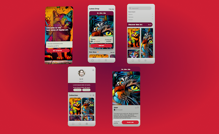
Visual Exploration
Having picked the tribal cubism theme and done an initial exploration on the splash screen, the visual exploration was continued by using the color palette and type system to design the home screen, search screen, profile screen, and NFT purchase screen, based on provided wireframes.

Scaling The Design System
The above image demonstrates the navigation component with three variations, one that can be used depending on whether th ehome, search, or profile screen is currently active.
Figma provides several useful features for scaling the design system to easily design more screens consistently, including the ability to save fonts and colors, and create components with variations. The navigation menu was created as a component, using the variants feature to allow the menu to show different icons as active depending on the context.
Impact and Summary
Overall, this design work was a very helpful way for me to learn the basics of Figma, from basic features like moving around and frames, to more advances features like components and variants. I better understood how fonts and colors can be saved in Figma to scale a design. Overall, I achieved my goal of being able to more effectively collaborate with professional designers in Figma.
