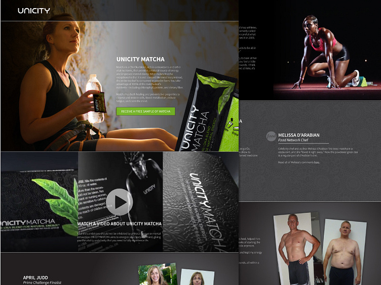
Matcha Phoenix microsite
This microsite was created to receive the visitors of a targeted ad campaign. Depending on the ad responded to, the visitor was taken to one of two pages—one focusing on the benefits and draws of Unicity Matcha, the other focusing on Unicity’s business opportunity. The long-form page was designed to take a user through an informational experience addressing common concerns of the audience. The common call to action throughout each page is a shortcut to the free sample request form that gathered competed and partial form submissions to generate educated leads.
More by John Van Orman View profile
Like
