Task Modal
Hey Dribbblers 🏀,
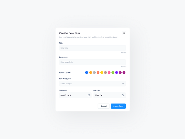
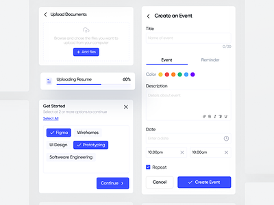
❖ The task modal should be designed in a simple and intuitive way, with clear labeling and instructions to guide the user through the process.
❖ The first element in the task modal should be a text field where the user can enter the title of the task. This field should be prominently displayed and easy to access.
❖ Below the title field, there should be a larger text area where the user can enter a more detailed description of the task. This field can be expanded or collapsed as needed, depending on the amount of information the user wants to include.
❖ To select a label color for the task, the user can click on a color picker widget located in the task modal. The color picker should offer a range of colors that are easy to distinguish from one another.
❖ The start and end dates of the task can be selected using a date picker widget. The date picker should be easy to use and offer clear feedback to the user when a date is selected.
❖ To make the task modal even more user-friendly, it can include some additional features such as the ability to set reminders or add attachments to the task.
❖ Once the user has filled out all the necessary information, they can click a "Save" button to save the task and close the modal. Alternatively, they can click a "Cancel" button to discard any changes they have made.
Hope you like it and feel free to leave comments and feedback.
Don't forget to press "L" if you enjoy watching this ❤️.
Thanks for checking it out!
If you have comments, let me know!
Say hello at 📧
ux.sergushkin@gmail.com
Visit my Website 🌎
dmitrysergushkin.com
For more inspiration, visit my profiles ✨

