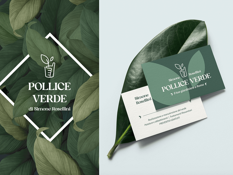
Flower Shop & Gardening Logo
The Concept
The concept revolves around the concept of gardening, having a "green thumb" which is the naming in Italian, means taking care of plants. So I opted for a hand wrapping a plant, where the fingers represent the soil layers and the figurative image that is perceived at a glance is a sprout in a pot.
Thumb: Positivity & professionalismal
Fingers: Soil layers
Sprout: Nature & growth
The harmony of colors
We know that green is the color of nature, but a softer, pastel shade was needed to give that touch of elegance that the customer was looking for. Leaves play an important role in the decoration, they give depth to the visual without weighing down the layout.
The Font
The font used is called "Silk Flower Demo", to stay on the subject of flowers, nature and gardening. In fact, this font has a powerful and sophisticated character, it has graces but it is not classic, on the contrary, its irregular and dynamic shapes make it modern and perfect for this brand.
Hope you guys like it 😊
Contact me via on email: romanadesignart@gmail.com
Don't forget follow me and like the post (if you like it) 💗
If you want some inspiration, I do things on my Instagram account 📲
Let's shot! 🏀📸


