ChatGPT Finetuning SaaS landing page
ChatGPT Finetuning SaaS landing page (client concept)
Designed by Amri Arshad via KyndCreative
Client: Michael Shaimerden
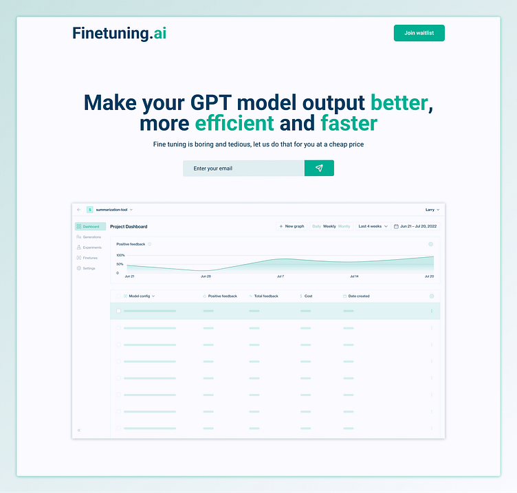
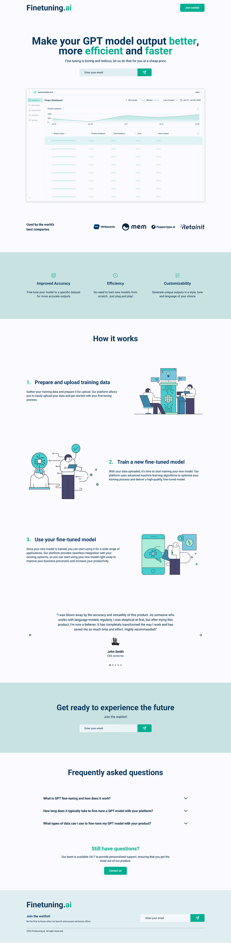
The client wanted to explore the possibility of developing a new platform to enable fine-tuning of AI language models. He needed a website design that would effectively communicate the benefits of their platform to potential users and generate interest in their product.
He also had specific requirements for the look and feel of the website, with a focus on creating a professional, minimalistic design that would convey a strong sense of trust. To achieve this, the website features a clean and modern layout, with a clear and easy-to-navigate structure that ensures users can quickly find the information they need.
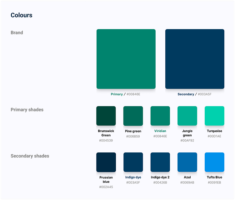
The website design incorporates the primary and secondary colours: Viridian and Indigo Dye. Viridian, a shade of green-blue, is often associated with nature, growth, and harmony. This colour is known to evoke a sense of calm and tranquillity, which can help create a welcoming and comfortable user experience on the website.
The secondary colour of Indigo Dye is a rich and deep shade of blue, despite its name suggesting it to be more purple. This colour is often associated with creativity, intuition, and wisdom. It can create a sense of depth and stability, and it pairs well with the primary colour of Viridian to create a balanced and harmonious colour scheme.
In colour theory, green and blue are considered cool colours that are often associated with calmness and relaxation, while deep blue is associated with trust and professionalism. The combination of these colours on the website can help to convey a sense of innovation, expertise, and trustworthiness, while also creating a visually appealing and user-friendly design.
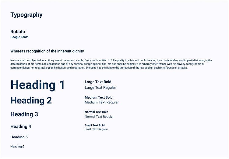
The Roboto font is an excellent fit for the website, as it perfectly complements the site's professional, minimalistic design aesthetic.
Final thoughts
The design of this GPT fine-tuning website successfully combines a professional, minimalistic aesthetic with an emphasis on trust and expertise.
The use of the viridian and indigo dye colour scheme, along with the choice of Roboto as the primary font, further reinforces the site's visual identity and messaging. The clean lines and simple letterforms of the font make it highly readable and easy to navigate, while the range of weights and styles available in the font family allow for greater flexibility in creating a hierarchy of text that guides users through the site's content.
The “features” and "how it works" section effectively communicate the benefits and value of the GPT fine-tuning service to potential users, while the FAQ and contact sections provide clear avenues for further engagement and support.
Throughout the design process, close collaboration with the client was key in ensuring that the website accurately reflected their goals and values. By working closely with the client to understand their needs and preferences, the final design of the website was able to effectively convey the unique value of their potential GPT fine-tuning service.
Acknowledgements
Client: Michael Shaimerden
Hero image (placeholder): Humanloop
Icons: Stratis UI Icons
Images: designstripe