Photography Logo
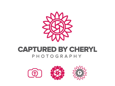
An idea for a client wanting a new photography logo that "modernized" the current logo she has. Here are four different options I came up with and I think I'm leaning more towards the one on top.
She wanted to incorporate the daisy-like flower, a lense, and a cross. It was difficult getting all three together, however, I am thinking the top one is the best option even without the cross.
What are your thoughts?
More by Megan Giddens View profile
Like
