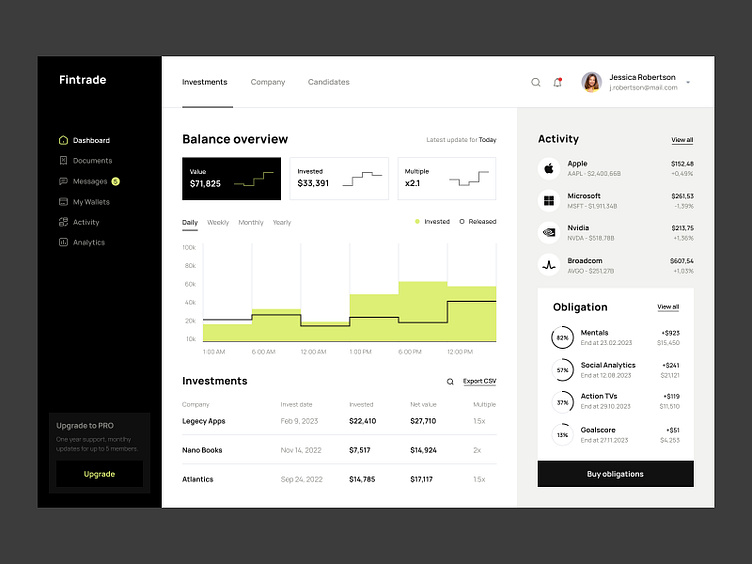
Fintrade dashboard
What was the purpose of the project?
Do you know that traders and investors need a lot of information from different sources simultaneously? And they learned to cope with such a large amount of data.
It is for the type of user for that we created this dashboard. All the essential information is on one screen; you don’t need to switch between different tabs to have complete information. This web application makes it more convenient for you to manage time and knowledge. A selected focus group tested work on user-friendly UX, and UI went through 4 rounds of A/B testing to determine the most flattering shapes and colors. What do you say? Would you use such an application in your work?
⭐️⭐️⭐️
We’re always excited about new projects!
You can find our contact details in the About section of our profile.


