Navigating the Amazon KDP Onboarding Flow: UX Redesign
Problem Statement
According to Artiom Dashinsky’s Weekly Product Design Exercise, 81% of Americans want to write a book. Additionally, self-published e-books account for 31% of all e-book sales in the Kindle store.
However, the current onboarding flow for Amazon KDP (Kindle Direct Publishing) is not user-friendly, making it difficult for first-time users to self-publish their e-books. The existing flow is compounded by confusing language, a lack of clear guidance on file formatting, and difficulties uploading cover images.
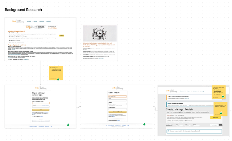
I took screenshots of exact designs existing currently, and then I added the sticky notes as well.
After adding the screenshots and notes, I identified several problems that could be improved, including confusing language, a lack of clear guidance on file formatting, and difficulties uploading cover images. By taking the time to identify these issues and document them, I ensured that any future improvements to the platform are based on the needs of the users.
About the audience
As mentioned in the problem statement
American origin
Want to write and Self publish books
Assumptions based on this
Literate
Interested in publishing books and
Do not want to get into the hassle of publishing physical copies
Why is this important?
I also highlighted the importance of the product to both the service provider and the users. For the provider, revenue can be a driving factor to invest in the product and make it more user-friendly. For users, the product offers an easy and hassle-free way to self-publish their work without the need for physical copies
Planning a new process
The “Jobs to Be Done” framework is a helpful tool when designing a user onboarding experience. It involves breaking down the user’s job into smaller tasks or steps to identify pain points and areas where the user may struggle. By understanding the user’s job and designing a flow that specifically addresses their needs, we can create a more effective and user-friendly onboarding experience. For example, when designing the onboarding flow for Amazon KDP, we used this framework to understand the job of self-publishing a book and broke it down into smaller steps such as formatting, designing a cover, and uploading files. This approach can lead to higher user engagement and satisfaction.
Conclusion
The redesigned onboarding flow for Amazon KDP resulted in a smoother, more user-friendly experience for first-time users. By simplifying the language, providing clear formatting guidelines, and streamlining the uploading process, we reduced the entry barrier for self-publishing, which ultimately resulted in more authors being able to publish their work on Amazon KDP.
The introduction of a checklist, improved feedback, and visual hierarchy also helped users to navigate the process more easily and reduce errors. Incorporating user testing allowed us to gather valuable feedback from real users, which helped to fine-tune the redesign and ensure that it met the users’ needs.
You can find this on...
Youtube Playlist: https://www.youtube.com/playlist?list=PLj2VePH9vvEJaaUH6oN3_G_HkWeddkDWj


