Laurel Consult - Branding
Laurel Consult provides high quality Educational solutions and Visa service for Vietnamese students and their families wishing to study abroad, work and live in Canada.
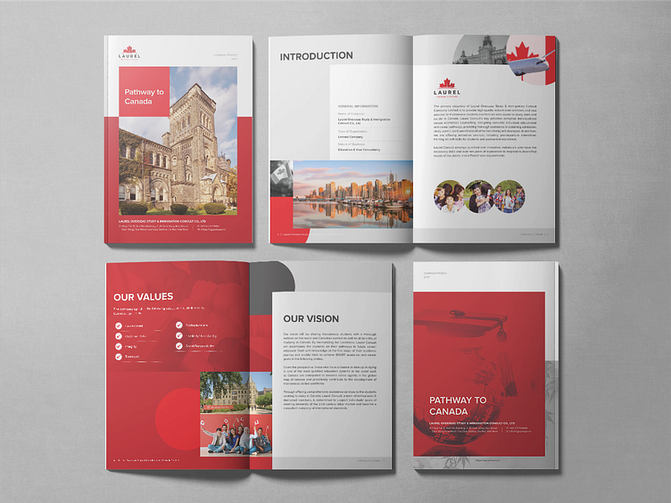
Laurel Consult's vision will be sharing Vietnamese students with a thoroughoutlook on the world and Canadian context as well as all benefitsof studying in Canada. By harmonizing the conditions, LaurelConsult will accompany the students on their pathways to futurecareer, empower them with knowledge at the first steps of theiracademic journey and enable them to achieve SMART academicand career goals in the following strides.
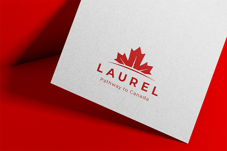
Stylized image from the typical maple leaf of Canada. It is also the focus area of the business. The image of maple leaves is strong and modern. The color palete is Magenta - a typical color of Canada, combined with a darker shade of red to create block effect. Red represents enthusiasm, passion, and at the same time symbolizes the luck and strength.
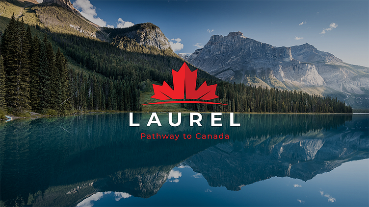
The combination of images and colors of the design represents the Company's brand Laurel Consult is a solid brand, full of enthusiasm, passion and constantly reaching out higher, further to bring customers the best experiences and services.
Hope you guys will like it.
Do you have any design projects? Let's work together to create something fantastic.
