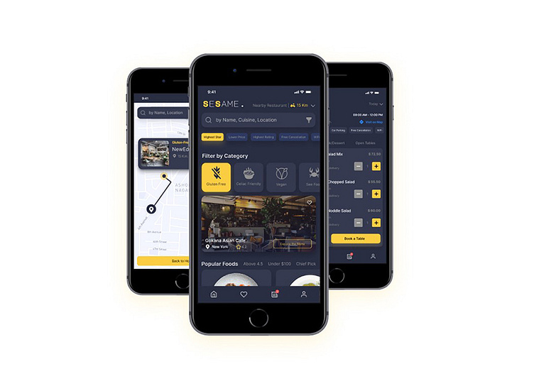
Sesame, Mobile Application
Gluten-Free Restaurant Finder
This is a job application task, for a international company, that I've done in less than 3 days. The main focus was on finding the places that respect to your food allergies eg. gluten, so, Filters had to be chosen carefully.
Design Considerations
· Screens are designed for a mobile application; a general version can be installed on both IOS & Android.
· Design is concentrating rather than on UX
· App name -Sesame- is a food ingredient, and it can implicitly refer to the movie in which the code of sesame was used to open the cave door (solve the problem).
· late registration is considered, to increase the retention rate
· User profile section, seems not to be a main page yet, instead we can think to community feature like “HappyCow” app, to help them find sooner by reviews added.
· based on the design brief, the first priority is to find a location while traveling, then on certain type of food: gluten-free. all in all, filters are important here
· with few population of Gluten sensitive peoples, and differences between these terms, and being most common in adults and much more common in women than men based on URL1 and URL 2, decided to consider a wider target group: gluten-free, Celiac-friendly, Vegans. Therefore, in food category, separate filters taken into account, and as a result, registered restaurants are responsible to differentiate among and consider the standards.
· based on this URL, Gluten-free regime holders can be served with meat /see food, fruit and vegetables, soups, and other wheaten-free recipes. so, these categories are considered in Home, too, to make a diverse search & menu.
· Again, for location search, more possibilities are offered: restaurant, hotel, bakery, health-store, etc.
the map, could be a virtual reality-powered, I wasn’t sure that how much innovative thinking can win this task !!!
I designed this landing, as another task. Design had to be modern, grab the user attention, and boost the retention rate, yet Responsive.
I utilized the story behind “Open Sesame” for Hero banner, designed a cave + sesame like illustration mentioning how this app can solve the hardship of finding a gluten-free restaurant.
While depicting main pages and features of application via mockups, some UX principles in my design are applied, too:
-Multiple conversion path
-Social proof
-FOMO
As always, don't forget to support! 💛
❤️ Like | 💬 Comment | 💾 Save | ⏩ Share
Let's Connect !
Drop a line to me: nemati.azam.id@gmail.com


