Frame 34
the story
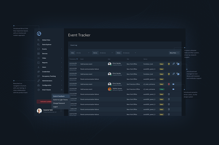
I have been (slowly, but surely) reworking my portfolio and trying to incorporate the brand visuals into the annotations, background, and overall effect of the portfolio piece. This screen, from Brivo Access, was highlighting some of the visual design and design system elements that went into the page.
honestly... it's a bit much. but it's a great dribbble shot, haha.
project background
This project was Brivo Access, a modern rework of Brivo's flagship security software. The theme was based on Material UI, but we had a lot of ability to add some unique elements to the brand to give it a customized look. And add in the very serious tone of IBM Plex Sans, and you had a pretty decent dark UI interface, built on some solid UX principles.
overall, it was a great project, and it had a lot of hard work from engineers, pm's, and other collaborators. was some real, old fashioned product work.
