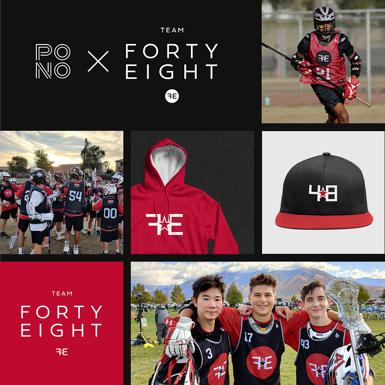
Team 48, Lacrosse Visual Identity
We always love to see our visual identity work out in the wild, where it really comes to life! On this project we collaborated with Jason Andersen, the founder of Team 48 Lacrosse, to create the team’s new logo set, color palette, font selections, and direction for branded apparel.
When we create a new identity system like this for a client, we include all of the assets and guidelines needed to apply the new identity to apparel, booths, signage, and more. So it wasn’t long after handing over the visual identity package to Team 48 Lacrosse that we started seeing photos of the players with the new logo on their uniforms and helmets. It’s always our goal to empower our clients and make it simple for them to apply their new visual identity to anything they can dream up.
Here's what our client @team48az had to say about the experience:
"When deciding to start a new youth sports program, I knew the attractiveness and interest of the logo played a key part in having potential players and their families notice us at Team 48. With this understanding, finding the right graphic designers to bring my thoughts to life was critical to our success when competing with incumbent programs. Thankfully, I had Pono on my side who not only listened to my vision for the company, but also provided insight into the "why" and "how" they can help accomplish what I was looking for. Pono's constant communication and transparency instilled in me complete confidence in their ability to deliver—and did they ever! Our logo, a year later, not only gets recognized all over Arizona, but is an incredible conversation starter with people who have no idea about youth lacrosse. I look forward to the future with Pono and can't thank them enough for the work they've done!"
—Jason Andersen, Founder, Team 48 Lacrosse
#visualidentity #graphicdesign #logodesign #visualidentitydesign #branding #brandidentity #logomark #designstudio #designagency #logowork #designinspiration


