Alarm Redesign - UI Challenge
Build a Better Snooze
Weekly UI challenge exercise:
Initially I decided to make the snooze button larger since it is in the position of prominence. This will allow sleepy users to more easily hit the snooze button. I also extended the width of the Stop Button to give users a little more ease there too.
Then I explored the IOS Dark Mode colors vs. the Accessible Dark Mode Colors. I did a l little refining and decided I wanted a timer countdown around the button. I also explored making the Stop Button a circle to match the snooze button.
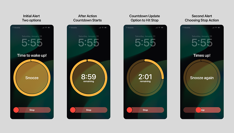
Final refinement. Timer on Snooze Button that starts when you hit snooze. I changed the Stop Button to a slider to help make it more difficult to use and aid in waking the user up. This shows the user flow for the snooze.
