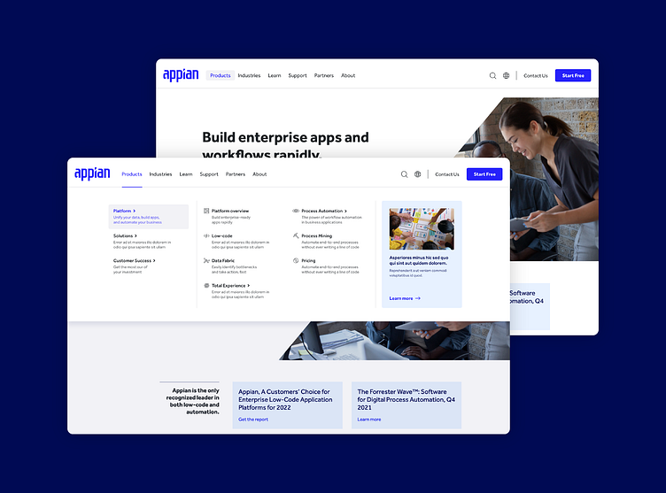
Global navigation redesign
There were many issues with the previous version of the appian global navigation. There were large gaps of unused white space, it was not organized in a way that was easy to understand for the users, and users had to click multiple times into multiple nested categories to find what they were looking for. My role in this project included structuring and running a design sprint, facilitating the restructuring of the IA with the main stakeholders, wireframe, prototype, and design of the new navigation.
Art Direction: Jessica Elliott
More by Bailey Adair View profile
Like


