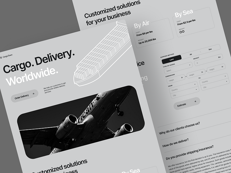
Cargo Delivery Landing Page Design Concept
Interesting color schemes are a must for an eye-catching UI/UX design. But we thought — what if we pick the opposite approach? Here is the result: a landing page concept for a cargo delivery company. Thanks to the limited color palette consisting of black and white colors the page has higher chances of clinging to the client’s mind. They also give the website a professional look where the company knows what it’s doing. The design is rather minimalistic, so nothing distracts the clients from gathering the information and estimating the shipment.
Have a beautiful idea in mind? Let's collaborate!
hi@conceptzilla.com
Conceptzilla
A design concept is what you need when time crunch doesn't allow for a complete process. This is where Conceptzilla comes in handy. We design up to four main screens of your product, ready for public display. Fixed price. One week.
Let's collaborate!
hi@conceptzilla.com
Discover more about us at conceptzilla.com

