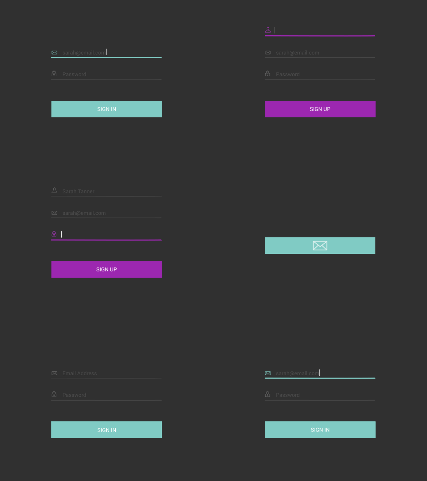
Single Sign In / Sign Up User Flow
I've been thinking about this Sign In / Sign Up flow for a while now, so here it is.
This idea was prompted by my frustration when looking for the sign in button on some websites. Yes, make the sign up button prominent for new users, but why make it frustrating for existing users to sign in?
My solution: Use data and create a single more fluid experience.
Simply click the email option, type in your email and let the backend data figure out if you're a returning user or new user. From there, new users can be directed to an onboarding experiences, if applicable, and returning users can go on their merry way.
Genius, no?
To my knowledge, I haven't seen any websites do this (or it wasn't very memorable). If you've seen this concept in practice, please share in the comments.
— UI // UX // Interaction // After Effects —
