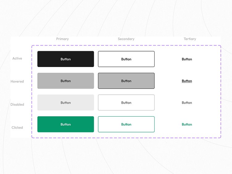
Introducing a User-Focused Button Component for Your Design Need
As product designers, we understand the importance of creating designs prioritizing the user's needs. With this in mind, we are proud to introduce our new button component that is specifically designed with the user in mind.
Our button component has been designed to meet the accessibility needs of all users, regardless of their abilities. The component has different states, including hover, active, and disabled, to provide a clear visual cue to the user about the button's function. The component's design is clean and simple, making it easy for users to understand and interact with.
One of the main features of our button component is its accessibility. It's crucial to ensure that all users can use the button regardless of their abilities. Our component is designed with accessibility in mind, ensuring that it meets the standards set forth in the Web Content Accessibility Guidelines (WCAG). We've included features such as ARIA labels, keyboard focus indicators, and proper color contrast ratios to ensure that the button is accessible to all users.
The button component is also highly customizable, allowing you to tailor it to your specific needs. You can adjust the button's color, font, and size, among other things. Additionally, our component is designed to be easily integrated into your existing design system, making it a seamless addition to your designs.
In conclusion, our new button component is a user-focused, accessible, and highly customizable addition to your design toolkit. With its different states and accessibility features, it ensures that all users can interact with your product effectively. We believe that putting the user first is the key to creating successful designs, and we're excited to offer this component to help you achieve that goal.
