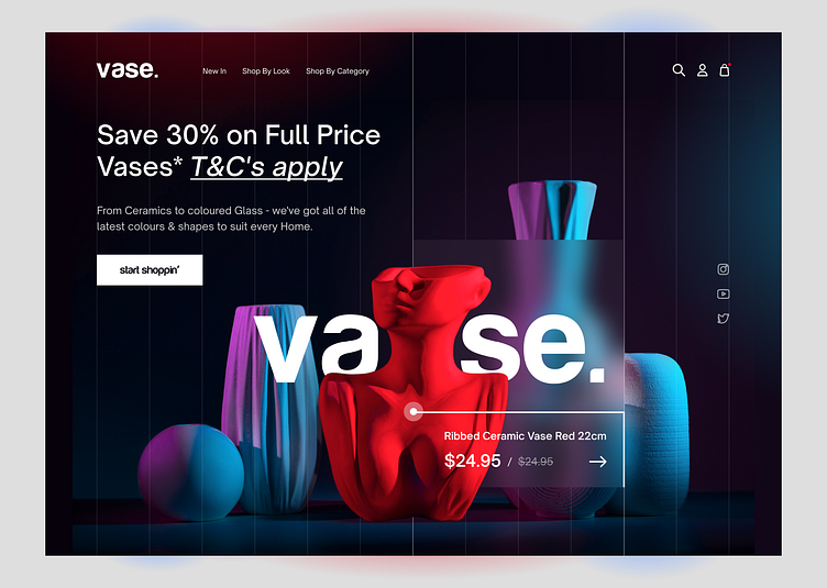
If Rihanna's Super Bowl performance was a website (concept)
If Rihanna's Super Bowl performance was a website. Or why a designer should learn to search an inspiration in everything around them. When we talk about inspiration for a designer, for some reason we pay attention on our specifically part of work: interior designer looks for inspiration in interiors, illustrator in paintings, interfaces designers in websites. But it's create a limits to our imagination with providing similar, typical visual algorithms in our heads.But the main point is different, as a designer we need to stay sensible and be open minded. When we search an inspiration in non specific type of places, we training our brain & imagination.
These are completely different things to watch Rihanna's performance at Super Bawl as average person and as a designer . We begin to see not an artist & performance, but a group of elements, composition, color palette, visual dynamic.
Now lets move to the details of performance as designer . What we see?Visual & composition are quite simple, minimal & understandable.
The color palette is a classic triad: black, white, red. A timeless combination with no doubt. The central figure is a solid classic red, which is intensified with the dark background & white color crowd. The composition includes red elements which are support the central figure. White also has subtones, which are only intensified the central red figure.
The overall composition is very monolithic with big sense of ease, weightlessness.Visual elements & presentation overall are timeless classics, minimalism style with attention to detail, color accents, a lot of good “white space”, good understanding of the main and secondary but with the unit of the entire composition.


