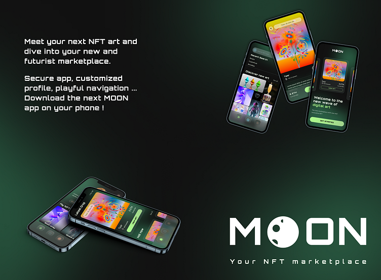
Futurist NFT marketplace - UI design exploration
Welcome on this case study for an NFT app !
Spoiler alert: this is a fake project.
Keep going and you will see how I handle this project and how I could jump into your team for your project too.
Project overview (TL;DR)
I know you might not have much time so here a small summary if you're in a hurry.
Design brief
MOON (a fake company) came to me with a specific request to revolutionize the NFT market on iOS and offer an unique experience for the users.
MOON provide their persona profile as a user who is familiar with digital art, crypto and NFT. He has a strong sense of visual aesthetic and high expectations.
Work and result
In this project, I came through all the design process on iPhone14 from the brief to the final prototyping on Figma. I delivered 6 views: splash screen, home, search (active and no active), profile and the NFT card detail (here below - same order from left to right).
I created the brand image (logo, colors, typo ) and an entire UI library from scratch.
My Role: UI Design
Time: 4 weeks (part time)
Mission: Fake project as part of the Dribbble UI Design Course (Fev 2023)
Moodboards
The most expected board when a client is asking for a full project: a moodboard to target the artistic path.
I went with 2 main opposite direction.
Dark, futurist, "glassmorphism" inspiration (left one below)
Fun, geometric, bright (right one below)
I selected inspirations from Dribble and Pinterest mostly. Not only with NFT website/app as I didn't want to limit this creation step.
Wireframe and visual choice
The wireframes were provided by Dribble. I decided to go for the dark version as it matches more with what customers might expect from a NFT marketplace (those users are more likely to use dark mode on their phone notably).
I simulated the company choice with a limited cohort, and they confirmed the black one was their choice as well.
Visual exploration
Now that I have my artistic path and my client request with the wireframe, let's translate this into an app design.
Regarding the splash screen:
I absolutely wanted to put NFT as the main elements: if you go on an NFT app, you want to see art
I wanted to invite the user into the app directly with the splash screen
I didn't know yet if I was going to put the MOON logo on the other view, so I wanted the logo on it.
I created 4 iterations, and played with the colors, layout, multiple themes.
I knew I would put cards on the home, so I kept the final one which merged all my constraints. The others lacked uniqueness. I liked the first one, but not for this NFT app: we can't see the art enough.
Based on this splash screen, I applied the style to create an home.
Again I did multiple layout, followed the design I imagined and landed on this wonderful, futuristic, clean and unisex NFT app for MOON.
Lock and scale design
Following this direction, I naturally extended the charter to the other screen (following the wireframes).
I voluntary didn't want to explore different disposition as wireframes reflect client request. If I wanted to explore, I would do it while building the wireframes to present different options to the client so he can make a choice with all the constraints in mind.
I played a lot with this universe, built the UI library and put emphasis on typography at the same time to be sure all pages in the design would be balanced and synchronized.
UI library
I found it really interesting to build an UI library mobile first.
The colors and components are 100% matching with the design system and the charter we built to stay consistent everywhere in the app and create a complete new world (on the "MOON" ?)
I prefer creating and saving components on the same background as they are going to be used on. It helps me to adjust the contrast ratio, if needed. It gives also a direct look on the final result.
Final result
Thanks to my test users cohort feedbacks, I made minor improvements on my design, and definitively freeze the aesthetic and UI library as I would do in a real project.
Next step together?
Summary
With this fake NFT project, I finally could design an NFT app.
I could share and improve my experience with users and coworkers from the course, discover various design from them and discussed with my mentor Taya.
I definitively learnt more about the UI issues and I know how to build a proper and clean UI library and UI system.
Contact
If you are interested about my work, I will post and update the new projects I used to work on and the ones I'm currently doing.
It's so diversified and interesting
strong dev agency
author/publisher relationship online platform
fun and playful administration doc app
... and many others
If you want to work with me, don't hesitate to contact me on LinkedIn.
Last but not least: all the NFT or picture are not mine but are free to used.
I borrowed them to illustrate the design only, all credits to their authors.
And of course, a big thank you to Dribble team and Taya Yamenko.


