Subway Tiles: Development of a Typeface
Objective:
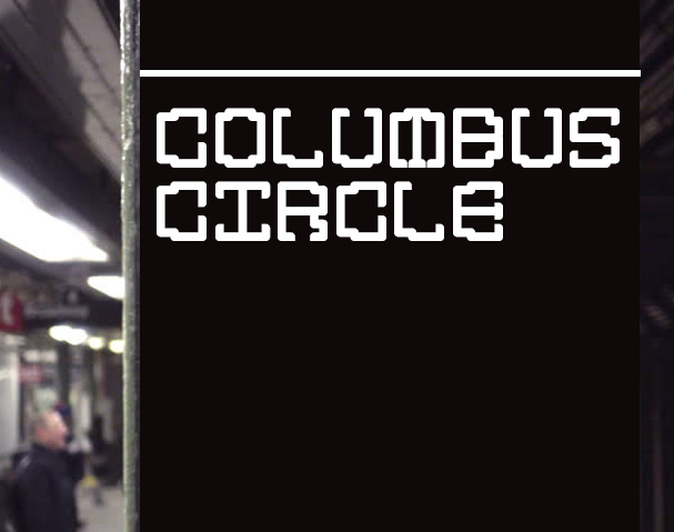
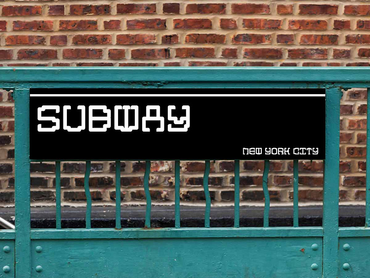
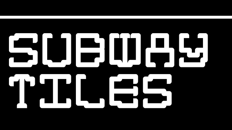
Subway Tiles is a typeface design initiative inspired by the iconic handmade mosaic lettering and the timeless Helvetica typeface seen throughout the New York City subway system. The goal was to create a unique, variable sans-serif typeface that honors the rich history and distinct style of the Metropolitan Transportation Authority (MTA) signage while ensuring legibility and versatility in modern design applications. Subway Tiles typeface successfully bridges the gap between the historic mosaic signage of New York City's subway system and Helvetica. By combining these two influences, the typeface offers a unique blend of tradition and contemporary design. Subway Tiles are available in 3 styles.
Design:
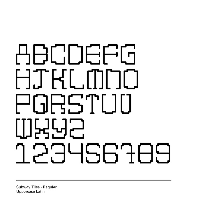
Subway Tiles is a sans-serif typeface that merges the handcrafted mosaic aesthetics of traditional subway signage with the clean, uniform characteristics of Helvetica. Each letter is meticulously designed with a mosaic-style pattern, utilizing squares, rectangles, and rounded corners as the building blocks of the letters. The typeface draws on the clean lines and uniformity of Helvetica, ensuring that Subway Tiles maintains a high level of legibility and consistency. In keeping with the tradition of subway signage, Subway Tiles exclusively uses uppercase letters.
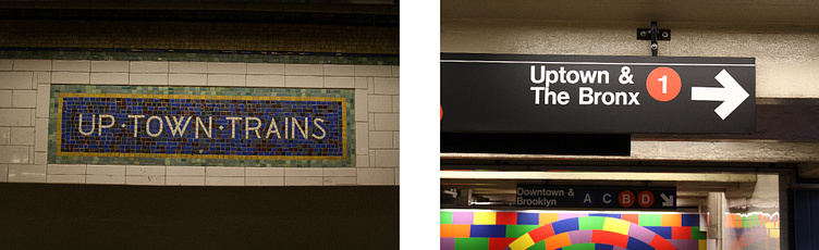
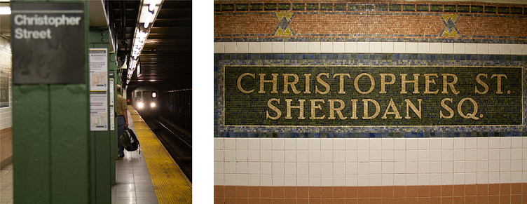
The NYC MTA subway system features two iconic styles of typography. Both are integral to the NYC subway system, representing different eras of design and function while serving the practical needs of millions of daily commuters.
Handcrafted Mosaic Text:
The original subway stations, especially those built in the early 20th century, often feature beautifully crafted mosaic tile signs. These mosaics are made up of small, square tiles meticulously arranged to form letters and words, typically all in uppercase. The text is usually laid out in a serif or sans-serif style, with the tiles providing a distinctive, tactile quality.
Helvetica Typeface:
The NYC subway system adopted Helvetica as the standard typeface for its signage in 1989. Helvetica, a clean and modern sans-serif typeface, is known for its clarity and legibility. The MTA uses it extensively on station signs, maps, and other informational displays.
Handcrafted mosaic lettering were all uppercase and had the same height. They used individual square mosaic pieces. Helvetica was easy to read and uniform. I combined aspects of both to establish a guideline and structure that honored and incorporated both typeface styles. I also questioned whether Subway Tiles would include be a serif or sans serif font.
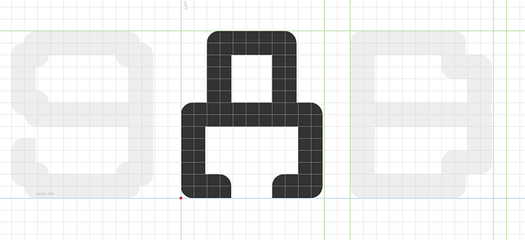
Subway Tiles uses a mosaic-style grid pattern, existing of a combination of squares, rectangles, and rounded corners as the foundational elements. Subway Tiles exclusively uses uppercase letters and the X-height of each letter is the same.
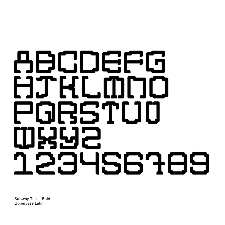
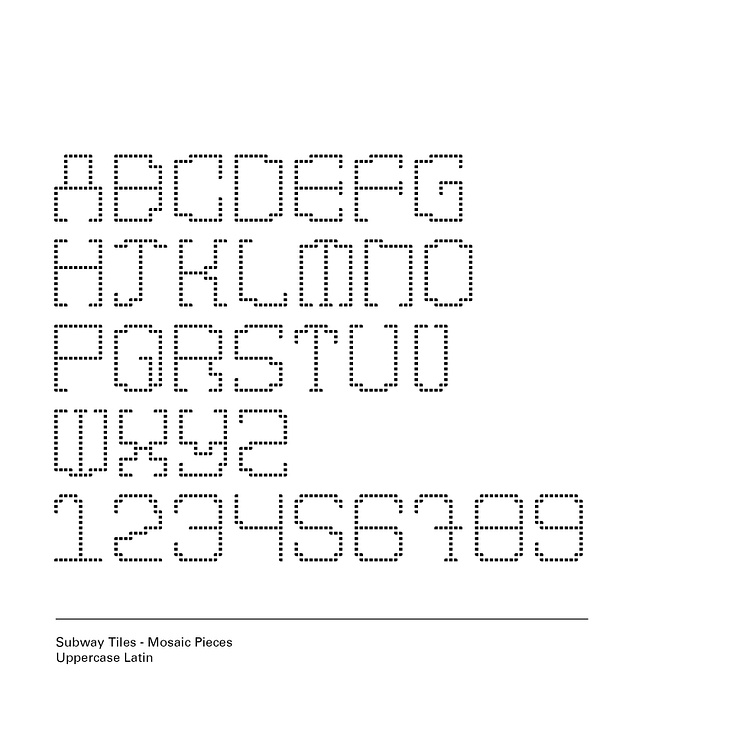
Subway Tiles is available in 3 options.