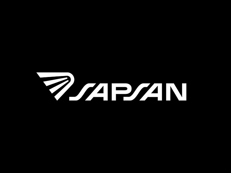
Sapsan logotype
Logo for a company specializing in the export of goods. I saw a great opportunity in the repetition of the ‘SA’ letters in the name and came up with this custom lettering solution. The symbol is a stylized bird's wing, because ‘SAPSAN’ is another name of the peregrine falcon – the fastest bird in the world.
More by Olga Vasik View profile
Like
